Fig. 16
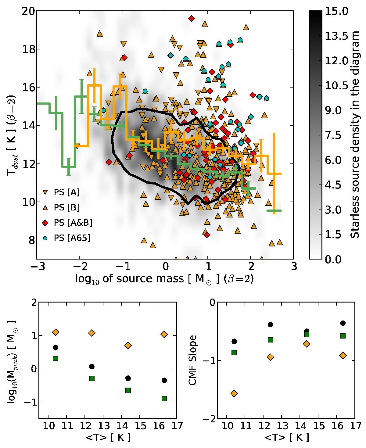
Upper panel: dust temperature − mass diagram. The solid black contour contains 90% of all the sources. The grey scale shows the source surface density in the diagram for starless sources. Orange triangles: protostellar sources with flag [1] from method A (tip-down) or B (tip-up). Red diamonds: protostellar sources from both methods (flag [2]). Blue circles: protostellar sources with AKARI 65 μm counterpart. The green and orange step lines are the dust temperatures averaged over bins of the log 10 of source masses for starless and protostellar sources, respectively. The vertical bars are the reduced standard deviations for each bin-average and show that the two populations are significantly separated, on average. Lower left panel: peak position of the best log-normal fit of the reduced CMF as a function of the field-averaged source temperature. Black points are for all sources, green squares are for starless sources, and orange diamonds are for protostellar sources. Lower right panel: same as lower left panel but for the slope of the best power-law fit of the high-mass tail of the reduced CMF.
Current usage metrics show cumulative count of Article Views (full-text article views including HTML views, PDF and ePub downloads, according to the available data) and Abstracts Views on Vision4Press platform.
Data correspond to usage on the plateform after 2015. The current usage metrics is available 48-96 hours after online publication and is updated daily on week days.
Initial download of the metrics may take a while.