Fig. 12
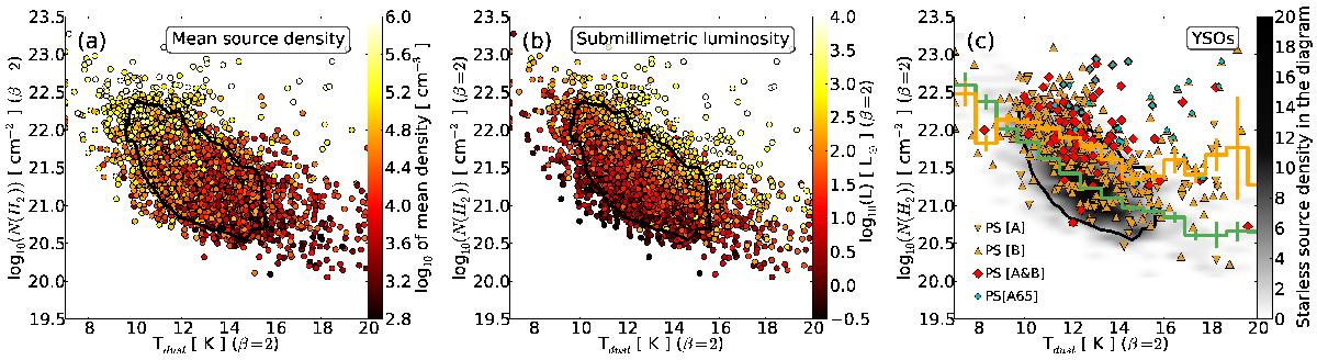
Mean column density − dust colour temperature diagrams for the galactic sources of our catalogue with distance flags 1 or 2. The colour scale indicates the mean particle density of sources in frame a), and the source submillimetre luminosity in frame b). Frame c) compares the location of protostellar sources (points) to starless sources (grey scale). The grey scale is the starless source density in the diagram, i.e. the number of sources per bin of temperature and column density. Orange triangles: protostellar sources with flag [1] from method A (tip-down) or B (tip-up). Red diamonds: protostellar sources from both methods (flag [2]). Blue circles: protostellar sources with AKARI 65 μm counterpart. The bin-averaged temperature curves for starless and protostellar sources are over-plotted in green and orange, respectively. The vertical bars are the standard deviations for each bin-average. The black contour contains ~75% of the sources shown in frame a), and is repeated in each frame to facilitate the comparison.
Current usage metrics show cumulative count of Article Views (full-text article views including HTML views, PDF and ePub downloads, according to the available data) and Abstracts Views on Vision4Press platform.
Data correspond to usage on the plateform after 2015. The current usage metrics is available 48-96 hours after online publication and is updated daily on week days.
Initial download of the metrics may take a while.