Fig. 2
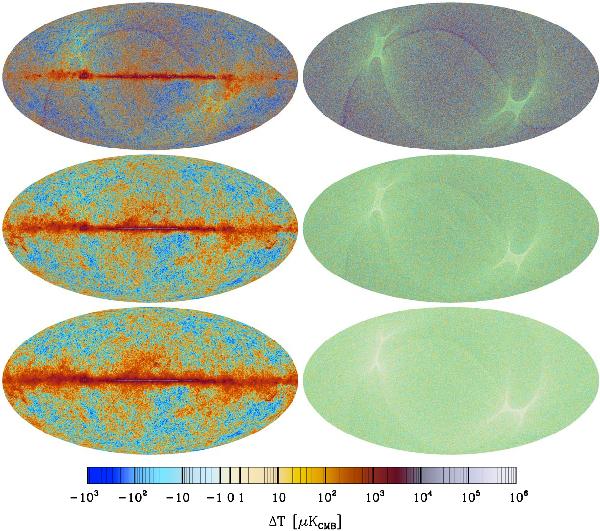
Sky maps used in the analysis of Planck data consistency. Top row: 70 GHz. Middle row: 100 GHz. Bottom row: 143 GHz. Left column: signal maps. Right column: noise maps derived from half-ring differences. All maps are Nside = 2048. These are the publicly-released maps corrected for monopole and dipole terms as described in the text. The impression of overall colour differences between the maps is due to the interaction between noise, the colour scale, and display resolution. For example, the larger positive and negative swings between pixels in the 70 GHz noise map pick up darker reds and blues farther from zero. Smaller swings around zero in the 100 and 143 GHz noise maps result in pastel yellows and blues in adjacent pixels, which when displayed at less than full-pixel resolution give an overall impression of green, a colour not used in the colour bar.
Current usage metrics show cumulative count of Article Views (full-text article views including HTML views, PDF and ePub downloads, according to the available data) and Abstracts Views on Vision4Press platform.
Data correspond to usage on the plateform after 2015. The current usage metrics is available 48-96 hours after online publication and is updated daily on week days.
Initial download of the metrics may take a while.