Fig. 6
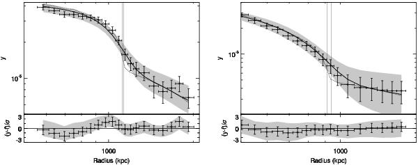
Comparison between the projected y radial profile and the best-fit shock model of the west (left) and south-east (right) pressure jumps. Upper panels: the points indicate the Coma y profile extracted from the respective sectors, whose centres and position angles are reported in Table 3. The plotted errors are the square root of the diagonal elements of the covariance matrix. Continuous and dotted lines are the best-fit projected y model reported in Table 3 after and before the convolution with the Planck PSF, respectively. The two vertical lines mark the ± 1σ position range of the jump. The gray shaded region indicates the envelope derived from the 68.4% of models with the lowest χ2. Lower panels: ratio between the observed and the best-fit model of the projected y profile in units of the relative error. The gray shaded region indicates the envelope derived from the 68.4% of models with the lowest χ2.
Current usage metrics show cumulative count of Article Views (full-text article views including HTML views, PDF and ePub downloads, according to the available data) and Abstracts Views on Vision4Press platform.
Data correspond to usage on the plateform after 2015. The current usage metrics is available 48-96 hours after online publication and is updated daily on week days.
Initial download of the metrics may take a while.