Fig. B.6
Download original image
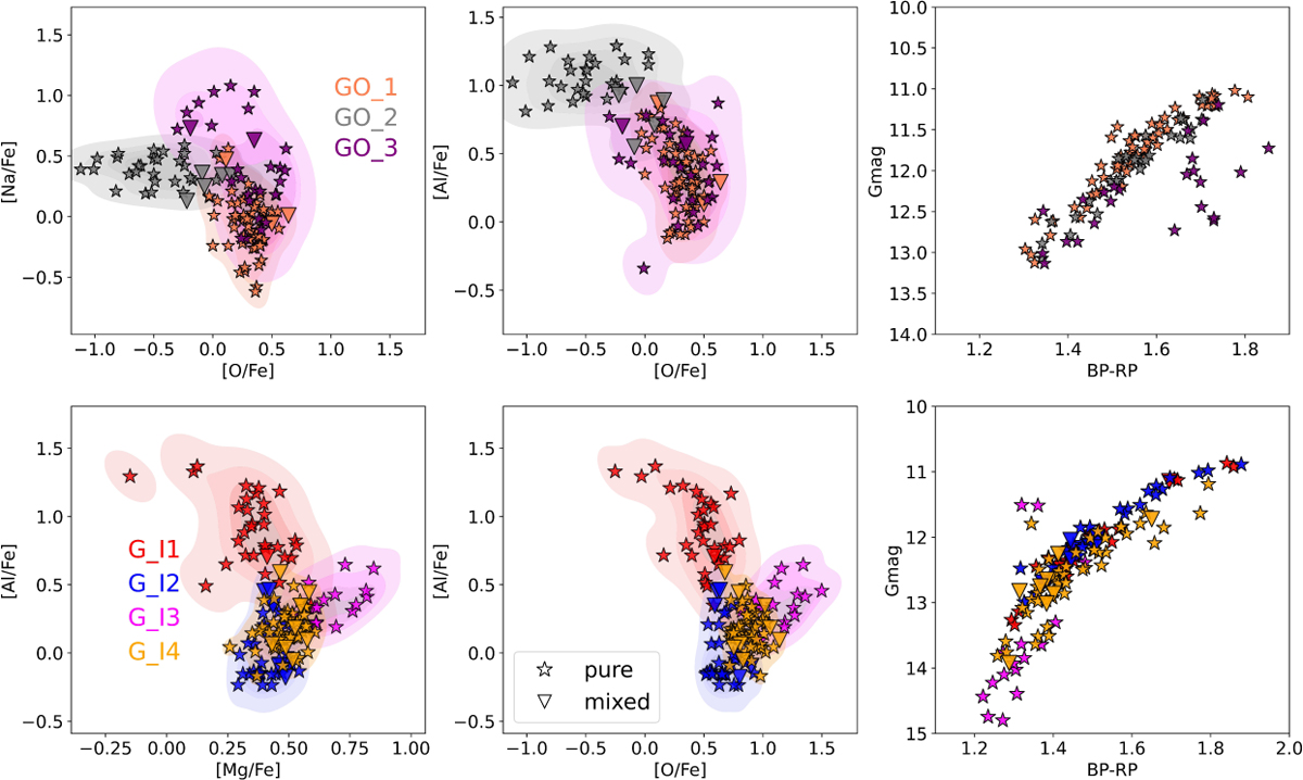
Anticorrelations colored by groups following GMM classification and color scheme of of the GMM models. Each star is colored by the group which has the maximum probability. The right hand panels show the Color Magnitude Diagrams. Top row: optical sample. Bottom row: near infrared sample. Shaded contours represent the KDE of the datapoints.
Current usage metrics show cumulative count of Article Views (full-text article views including HTML views, PDF and ePub downloads, according to the available data) and Abstracts Views on Vision4Press platform.
Data correspond to usage on the plateform after 2015. The current usage metrics is available 48-96 hours after online publication and is updated daily on week days.
Initial download of the metrics may take a while.