Fig. 7.
Download original image
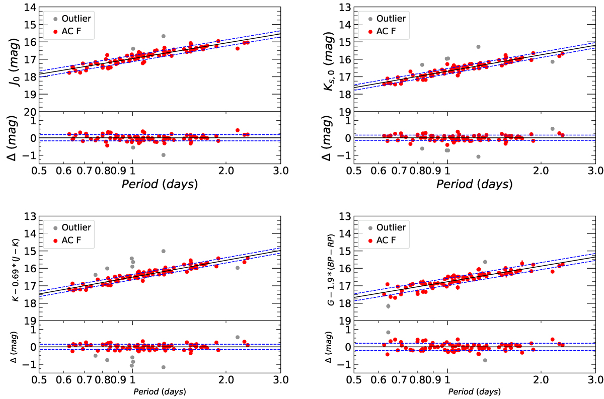
Example best fits for the F ACs in the LMC. From left to right, we show in the top panels the PLJ and the PLKs relations, and in the bottom panels, we show the PWJKs and the PWG relations, respectively. The red and gray filled circles are the data used for the fit and the outliers. The solid black line is the best fit to the data, while the dashed blue lines show the ±1σ levels. Upper panels and lower panels in each figure contain the fits and the residuals of the fit, respectively. The fits for the other bands are in the Appendix E.
Current usage metrics show cumulative count of Article Views (full-text article views including HTML views, PDF and ePub downloads, according to the available data) and Abstracts Views on Vision4Press platform.
Data correspond to usage on the plateform after 2015. The current usage metrics is available 48-96 hours after online publication and is updated daily on week days.
Initial download of the metrics may take a while.