Open Access
Fig. 3
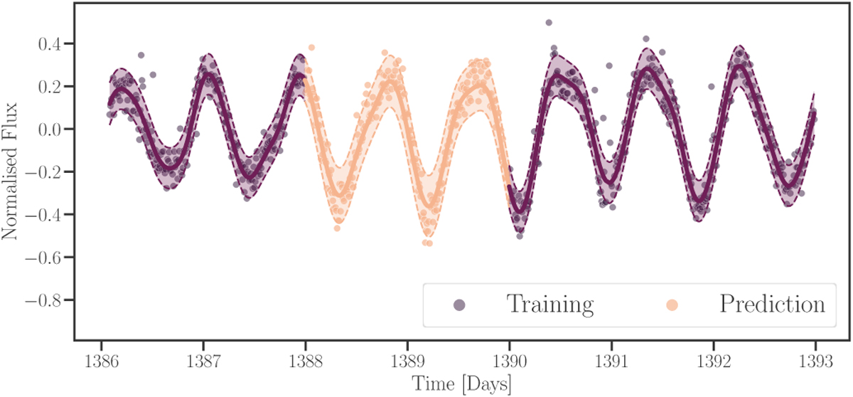
Download original image
Demonstration of time series interpolation with gallifrey. The figure shows the same data as Fig. 2. The purple data points have been used to train and condition the GP. The yellow region shows the prediction. The central line shows the mean prediction, and the confidence bands correspond to one standard deviation.
Current usage metrics show cumulative count of Article Views (full-text article views including HTML views, PDF and ePub downloads, according to the available data) and Abstracts Views on Vision4Press platform.
Data correspond to usage on the plateform after 2015. The current usage metrics is available 48-96 hours after online publication and is updated daily on week days.
Initial download of the metrics may take a while.