Fig. 5.
Download original image
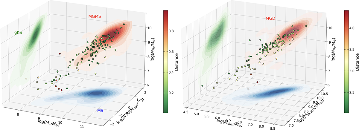
Fundamental plane of SF and ISM. Left panel: MH2 vs. M⋆, and SFR in a three-dimensional projection. Data are color coded as a function of their distance from the best-fit function. The green, blue, and red-shaded heat maps represent the density profiles of the data on the gKS, MGMS, and MS planes, respectively. Contours are shown to better distinguish the density profile, divided into ten levels. The best-fit relation of each two-dimensional panel is color coded according to the data heat maps, while best-fit parameters are listed in Table D.1. Right panel: MH2 vs. MHI, R25, and Mdust in a three-dimensional projection. Color coding is the same as in the left panel. The green, blue, and red-shaded heat maps represent the density profiles of the data on the MH2-MHI, R25, Mdust-MHI, R25, and MGD planes, respectively.
Current usage metrics show cumulative count of Article Views (full-text article views including HTML views, PDF and ePub downloads, according to the available data) and Abstracts Views on Vision4Press platform.
Data correspond to usage on the plateform after 2015. The current usage metrics is available 48-96 hours after online publication and is updated daily on week days.
Initial download of the metrics may take a while.