Fig. 10
Download original image
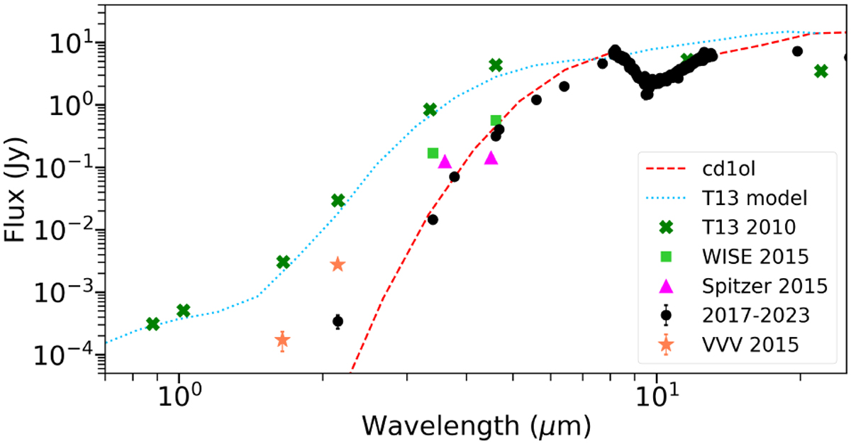
Comparison of data and models for different SED epochs. The 2010 observations (green) and best-fitting 2010 model (cyan) from T13 can be compared to the full observed SED a decade later (black) and our cd1ol model (red). We also show WISE and Spitzer fluxes from 2015 in green and magenta squares, respectively. The VVV fluxes are shown in orange.
Current usage metrics show cumulative count of Article Views (full-text article views including HTML views, PDF and ePub downloads, according to the available data) and Abstracts Views on Vision4Press platform.
Data correspond to usage on the plateform after 2015. The current usage metrics is available 48-96 hours after online publication and is updated daily on week days.
Initial download of the metrics may take a while.