Fig. 6
Download original image
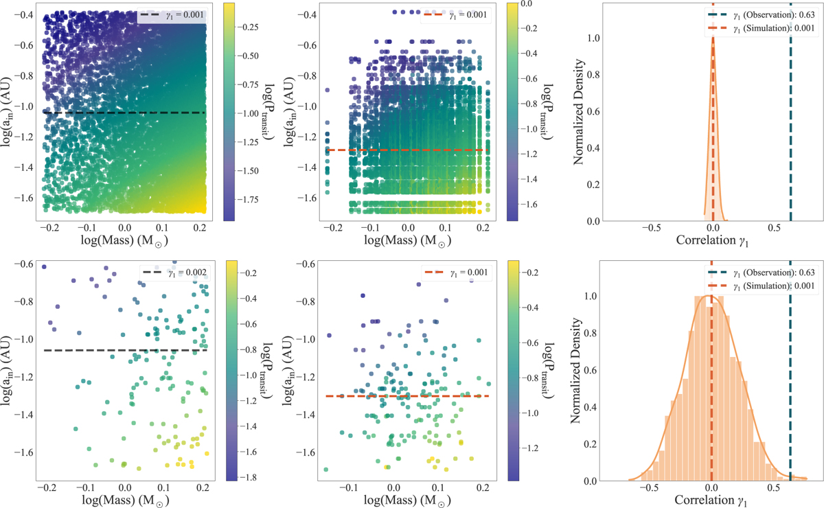
Simulated analysis of observational selection bias. The panels in the top row represent Ntest (with a larger number of sample sets set to 10 000), while those in the bottom row represent Nobs (the same number of sample sets as the observational data). The left panels show the results of uniformly random sampling within the range, and the middle panels show the random sampling in a way that uses observational data but applies the biases of transit detection. Points represent the distribution of simulated data, with the color bar indicating the distribution of Ptransit. Black and orange dashed lines indicate the fit results (γ1 of the correlation between the inner edge and stellar mass). Each of these four panels represents the median result from 1000 simulation runs. The right panels display the distribution of correlations between M★ and ain obtained from 1000 simulations, with meanings consistent with Fig. 4.
Current usage metrics show cumulative count of Article Views (full-text article views including HTML views, PDF and ePub downloads, according to the available data) and Abstracts Views on Vision4Press platform.
Data correspond to usage on the plateform after 2015. The current usage metrics is available 48-96 hours after online publication and is updated daily on week days.
Initial download of the metrics may take a while.