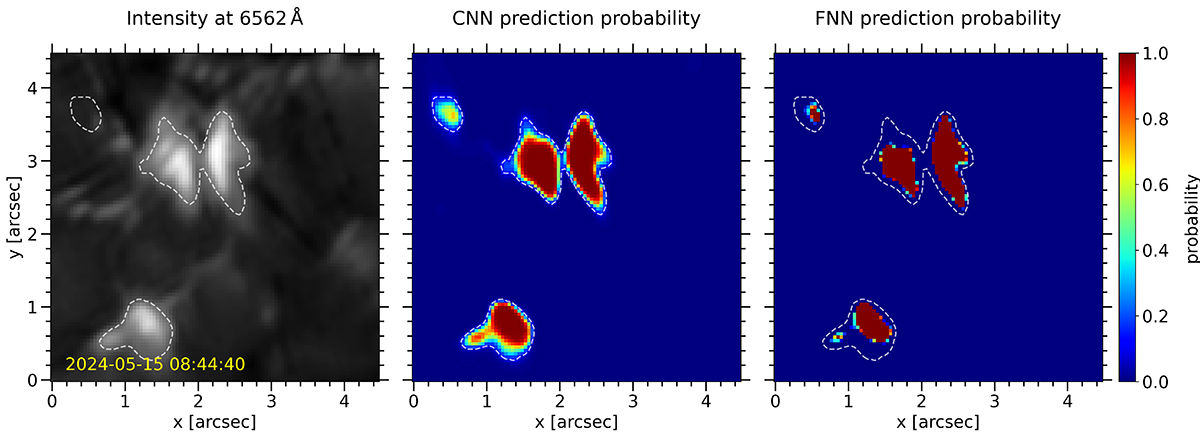
Fig. 7.
Download original image
Example of EB predictions done by the CNN and FNN SST models over a cutout of the new dataset. The left panel shows the intensity image in the red wing of Hα at +1 Å offset. The middle and right panels show the predictions done by the CNN and FNN models respectively. The colormap indicates the probability assigned by the models to each pixel of being an EB. The white dashed contours mark the 0.1 probability of the CNN prediction and are drawn in all panels to facilitate spatial comparison. An animation of this figure that shows the probability maps over the full time sequence is available in the online material.
Current usage metrics show cumulative count of Article Views (full-text article views including HTML views, PDF and ePub downloads, according to the available data) and Abstracts Views on Vision4Press platform.
Data correspond to usage on the plateform after 2015. The current usage metrics is available 48-96 hours after online publication and is updated daily on week days.
Initial download of the metrics may take a while.