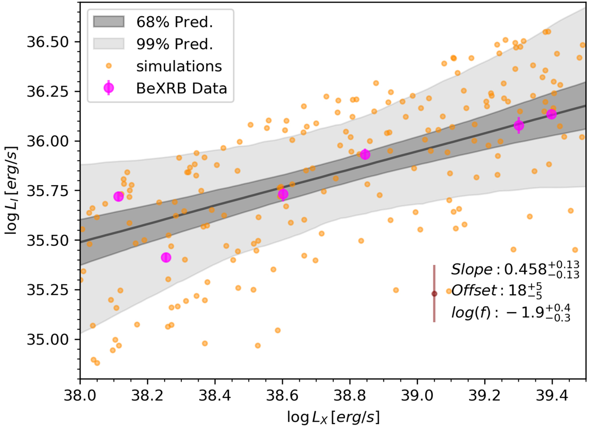
Fig. 6.
Download original image
Flare intensity as a function of log(LX), where observed data from BeXRBs are plotted with magenta colors. The best-fit line (black) and the 68–99% prediction bands are plotted with gray shade, while model parameters are given in the legend. For the modeled excess variance, we also plot an indicative spread with a maroon color, for easier comparison with the data. Orange points represent simulations for a random set of parameters (see text for details).
Current usage metrics show cumulative count of Article Views (full-text article views including HTML views, PDF and ePub downloads, according to the available data) and Abstracts Views on Vision4Press platform.
Data correspond to usage on the plateform after 2015. The current usage metrics is available 48-96 hours after online publication and is updated daily on week days.
Initial download of the metrics may take a while.