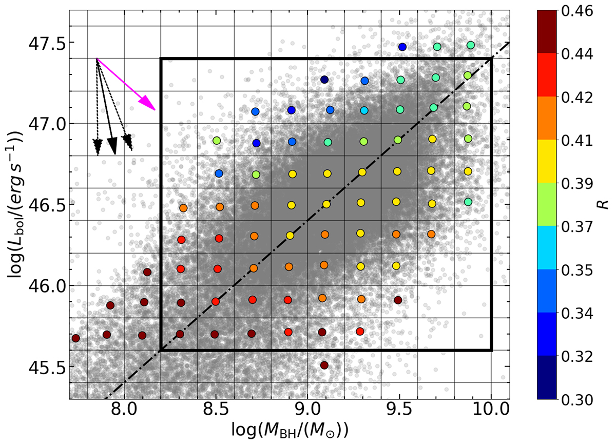
Fig. 10.
Download original image
log(MBH)–log(Lbol) plane, with R shown as coloured dots (see colour bar at right). The black rectangle shows the region where the PCA was evaluated. The black solid and dotted arrows represent the direction of the strongest correlation as in Fig. 7. The dash-dotted line marks a constant λEdd = 0.2, representing the average value of the sample, while the magenta arrow shows the direction expected if the increase in R were driven uniquely by the decrease in λEdd.
Current usage metrics show cumulative count of Article Views (full-text article views including HTML views, PDF and ePub downloads, according to the available data) and Abstracts Views on Vision4Press platform.
Data correspond to usage on the plateform after 2015. The current usage metrics is available 48-96 hours after online publication and is updated daily on week days.
Initial download of the metrics may take a while.