Fig. 8
Download original image
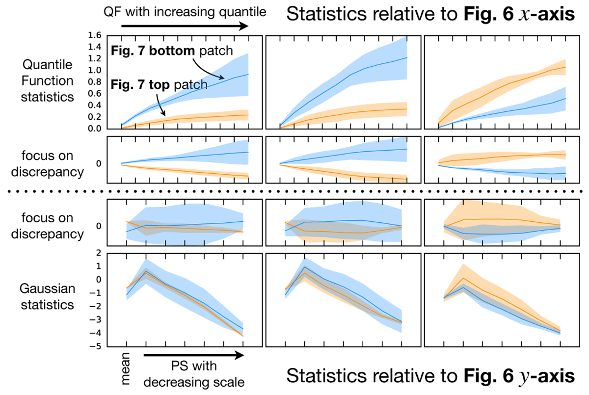
Statistics for the examples of Gaussian confusions shown in Fig. 7. In each row, the orange filled line (resp. band) corresponds to the mean (resp. standard deviation) of the statistics computed over the four 256 × 256 subpatches of the top patch of each pair of Fig. 7, and the corresponding blue lines and areas refer to the bottom patch of the pair. The top row corresponds to the statistics used in the x-axis of the scatter plot of Fig. 6, i.e., QF statistics, plotted with ten increasing quantile values, while the bottom row corresponds to the y-axis, i.e., Gaussian statistics, plotted starting with mean and followed by the binned PS with six decreasing scales. To better highlight the discrepancies between the two patches of a given pair, we report in second and third rows the offsets of the orange and blue filled lines with respect to their common mean.
Current usage metrics show cumulative count of Article Views (full-text article views including HTML views, PDF and ePub downloads, according to the available data) and Abstracts Views on Vision4Press platform.
Data correspond to usage on the plateform after 2015. The current usage metrics is available 48-96 hours after online publication and is updated daily on week days.
Initial download of the metrics may take a while.