Fig. 3.
Download original image
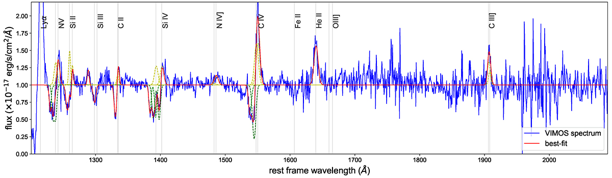
VLT/VIMOS spectrum with best-fit results. The flux is normalised to the continuum. The blue curve identifies the integrated spectrum; the total, multi-component best fit curve is in red, while all individual Gaussian (Voigt) components are shown in yellow (green). The most prominent line transitions are marked with grey vertical lines.
Current usage metrics show cumulative count of Article Views (full-text article views including HTML views, PDF and ePub downloads, according to the available data) and Abstracts Views on Vision4Press platform.
Data correspond to usage on the plateform after 2015. The current usage metrics is available 48-96 hours after online publication and is updated daily on week days.
Initial download of the metrics may take a while.