Fig. 4
Download original image
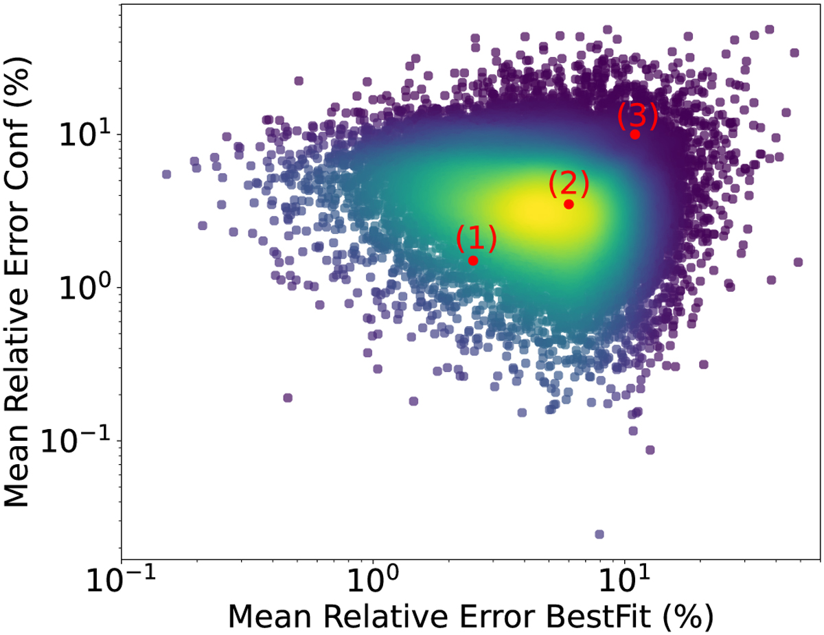
2D histogram representing the percent relative errors found in the testing dataset. The horizontal axis shows the best-fit errors, and the vertical axis shows the confidence line error. The colors represent the density of points. Yellow indicates the highest-density zones, and purple shows the lowest-density zones. The mean values of the distributions are μconfidence = 4% and μbest − fit = 8%. The red dots indicate samples from the different regions of the distribution that are visualized in the next figure.
Current usage metrics show cumulative count of Article Views (full-text article views including HTML views, PDF and ePub downloads, according to the available data) and Abstracts Views on Vision4Press platform.
Data correspond to usage on the plateform after 2015. The current usage metrics is available 48-96 hours after online publication and is updated daily on week days.
Initial download of the metrics may take a while.