Fig. 10
Download original image
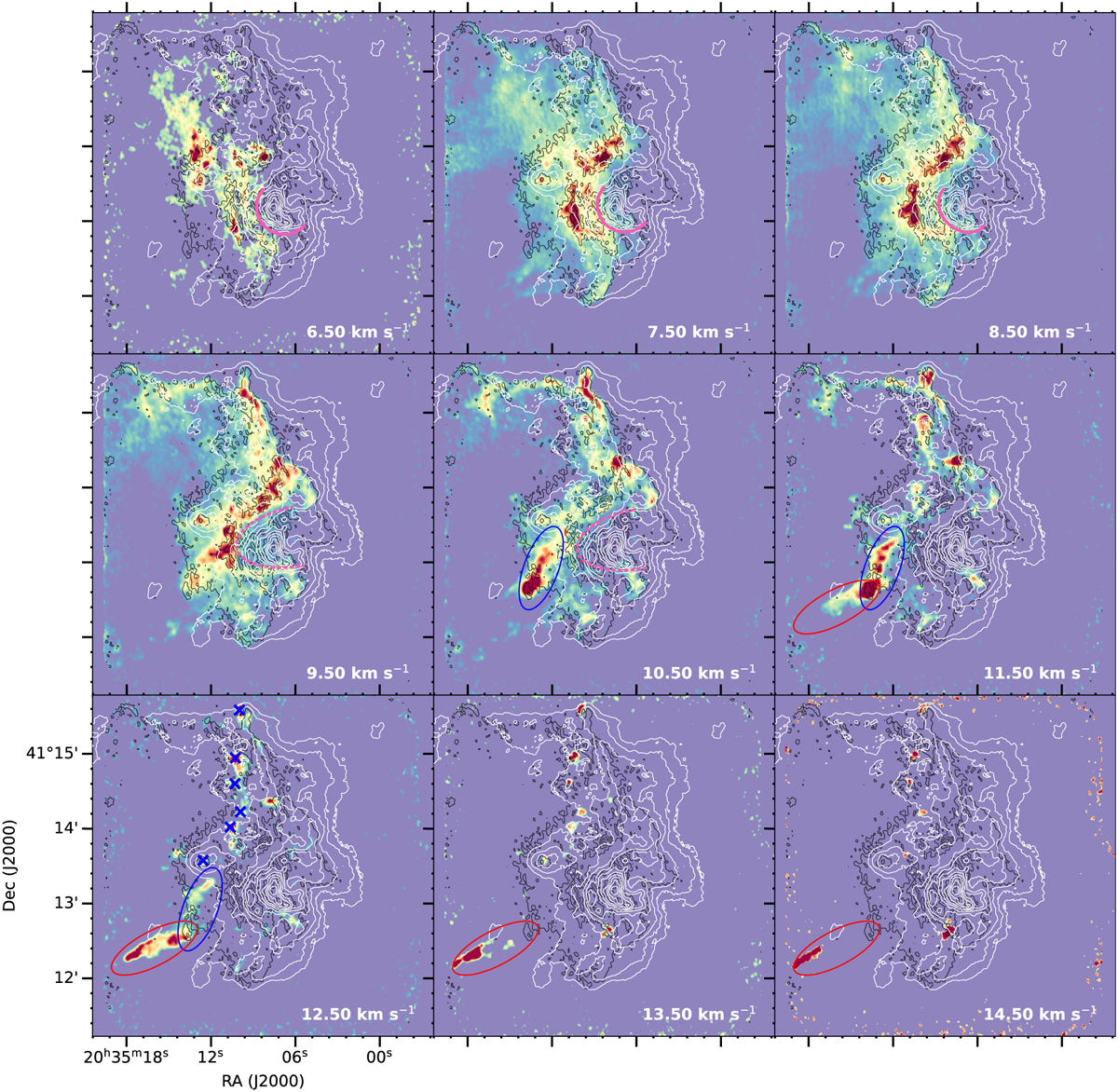
Velocity channel maps of HCO+ from 6.5 km s−1 until 14.5 km s−1. The velocity difference between the channel maps is 1 km s−1. Each channel map has different color scales and shows emission stronger than a 10 σrms. The flux scale per velocity channel map is varied to better highlight the individual emission features. The black and white contours are the mm and cm continuum emission, respectively, and the contour levels are the same as in Fig. 3. The pink sold lines and dashed lines at velocities from 6.5 km s−1 to 10.5 km s−1 show the outlines of the cavity created by the HII region of DR18-05. The blue ellipses marked at velocities from 10.5 km s−1 to 12.5 km s−1 and the red ellipses marked at velocities of 11.5 km s−1–14.5 km s−1 are indicated to blue and red-shifted lobes of the potential outflow (or jet) candidate, respectively. In the 12.5 km s−1 channel map, the blue cross symbols mark the positions of the extracted HCO+ and H13CO+ spectral lines (shown in Fig. 11) toward compact features.
Current usage metrics show cumulative count of Article Views (full-text article views including HTML views, PDF and ePub downloads, according to the available data) and Abstracts Views on Vision4Press platform.
Data correspond to usage on the plateform after 2015. The current usage metrics is available 48-96 hours after online publication and is updated daily on week days.
Initial download of the metrics may take a while.