Fig. 7.

Download original image
Mapping of the main spectral properties. Left panel: RGB composite of the LW filters (red: F410M, green: F356W, blue: F277W); the green channel, containing the emission in Hβ+[OIII] highlights the regions with the strongest line emission. The position of emission peaks in NIRCam SW (see also Figs. 3, 8, 9 and 10) are marked by red crosses (by “star” markers in the central and right panels); the bright core regions D1core and T1core discussed in Sects. 4.1 and 4.2 are marked by red asterisks (by plus plus symbols in the central and right panels). The (white) boxes outline the zoom-in regions shown in the other panels of the figure. Central panels: EW maps of [O III]+Hβ, as traced by the F356W filter (with F410M tracing the continuum); the data have been smoothed by a 2 px box kernel and low signal-to-noise pixel have been masked-out. The map has the same pixel-scale as the LW data (0.04 arcsec/px). Right panels:β-slope maps obtained by the pixel-by-pixel fitting of F115W, F150W and F200W. The data are in a 0.02 arcsec/px scale and have been smoothed by a 4 px box kernel. Low-signal pixel have been masked-out. Both in the central and left panels, a black line of 0.24″ is shown, for scale. The FWHM of the PSF in each panel is reported as a black/white circle in the bottom-right angle.
Fig. 8.
Zoom-in into the D1 region, showing the combined SW observations (F115W+F150W+F200W), the best-fit model of the core region, and its residuals. The apertures used for photometry are shown as white ellipses; for the D1core region, photometry is derived from a light-profile fitting (as described in the main text). For each of the apertures/regions, photometry is shown as black circles, with the SED best-fit model over-plotted as colored empty squares and relative spectrum. The best-fit of the UV slope is also shown and reported in the panels.
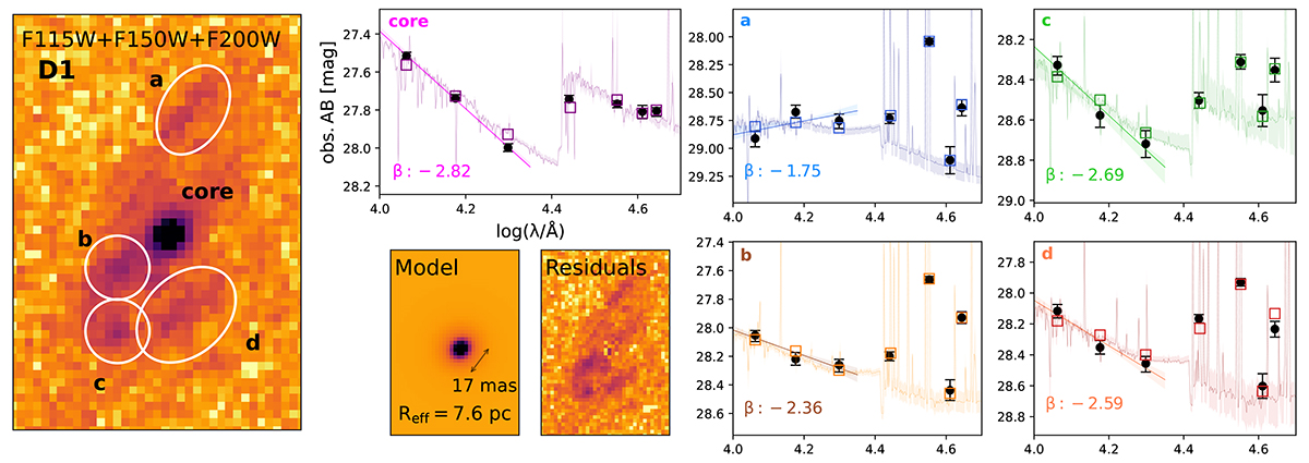

Fig. 9.
Zoom into the T1 system, shown as the sum of observations in the SW filters, the best-fit model of the core emission and its residuals. The results of photometry and of the broad-band SED fitting are shown in the right panel, both for T1core (blue lines) and for T1diff (orange lines), similarly to what done for the subregions of D1 in Fig. 8.
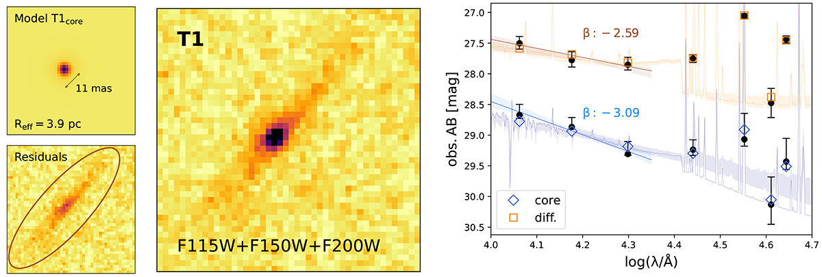

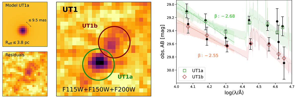
Fig. 10.
Same as Fig. 9 but for the UT1 system, with the best-fit model of the UT1a source (left panel) and the photometry + broad-band SED fitting results (right panel, green line for UT1a, red line for UT1b).

Current usage metrics show cumulative count of Article Views (full-text article views including HTML views, PDF and ePub downloads, according to the available data) and Abstracts Views on Vision4Press platform.
Data correspond to usage on the plateform after 2015. The current usage metrics is available 48-96 hours after online publication and is updated daily on week days.
Initial download of the metrics may take a while.