Fig. 13
Download original image
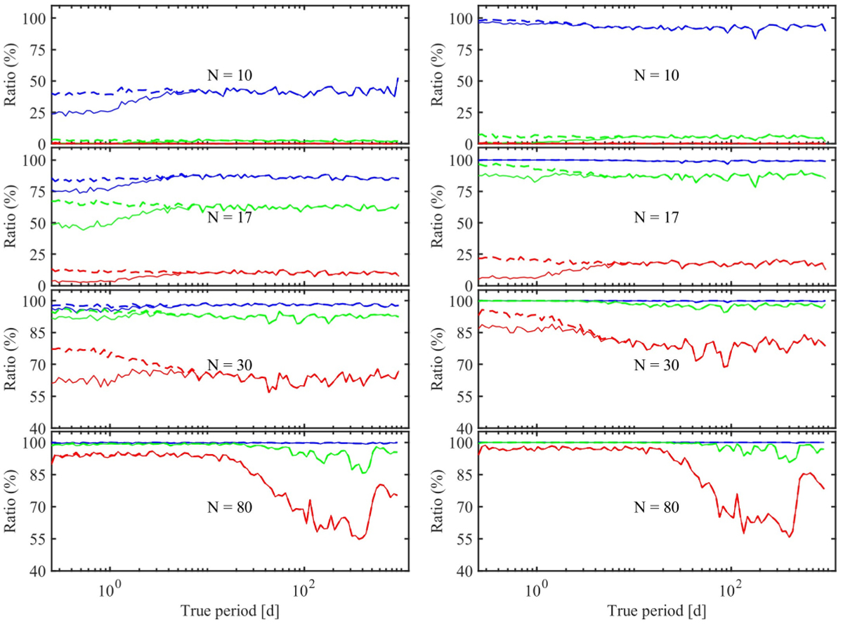
Performance for the period recovery of the pipeline applied on simple simulated data. N is the number of data points in the time series. The colour curves correspond to different S/N ratios s (blue: 50. green: 10, red: 5). The dashed curves correspond to the recovery before the application of the statistical test on the period significance level; the continuous curve refers to the recovery rate after having applied the selection. Left: eccentric orbits; Right: circular orbits.
Current usage metrics show cumulative count of Article Views (full-text article views including HTML views, PDF and ePub downloads, according to the available data) and Abstracts Views on Vision4Press platform.
Data correspond to usage on the plateform after 2015. The current usage metrics is available 48-96 hours after online publication and is updated daily on week days.
Initial download of the metrics may take a while.