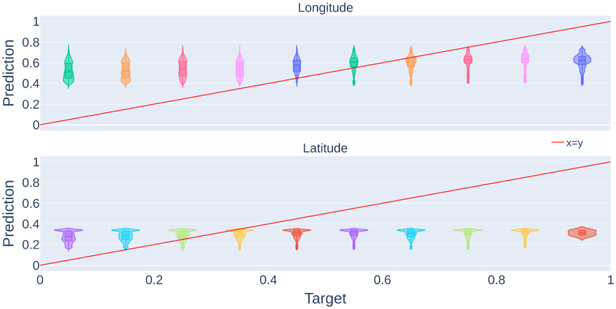
Fig. B.2
Download original image
Violin plot of the predicted position encoding for longitude (top) and latitude (bottom) for every 0.1 position encoding. The x-axis corresponds to true labels while the y-axis displays the predicted value. The red curve represents the perfect regression solution (predict = true label). Both the latitude and longitude distributions present every sign of a close-to-random distribution.
Current usage metrics show cumulative count of Article Views (full-text article views including HTML views, PDF and ePub downloads, according to the available data) and Abstracts Views on Vision4Press platform.
Data correspond to usage on the plateform after 2015. The current usage metrics is available 48-96 hours after online publication and is updated daily on week days.
Initial download of the metrics may take a while.