Fig. 3.
Download original image
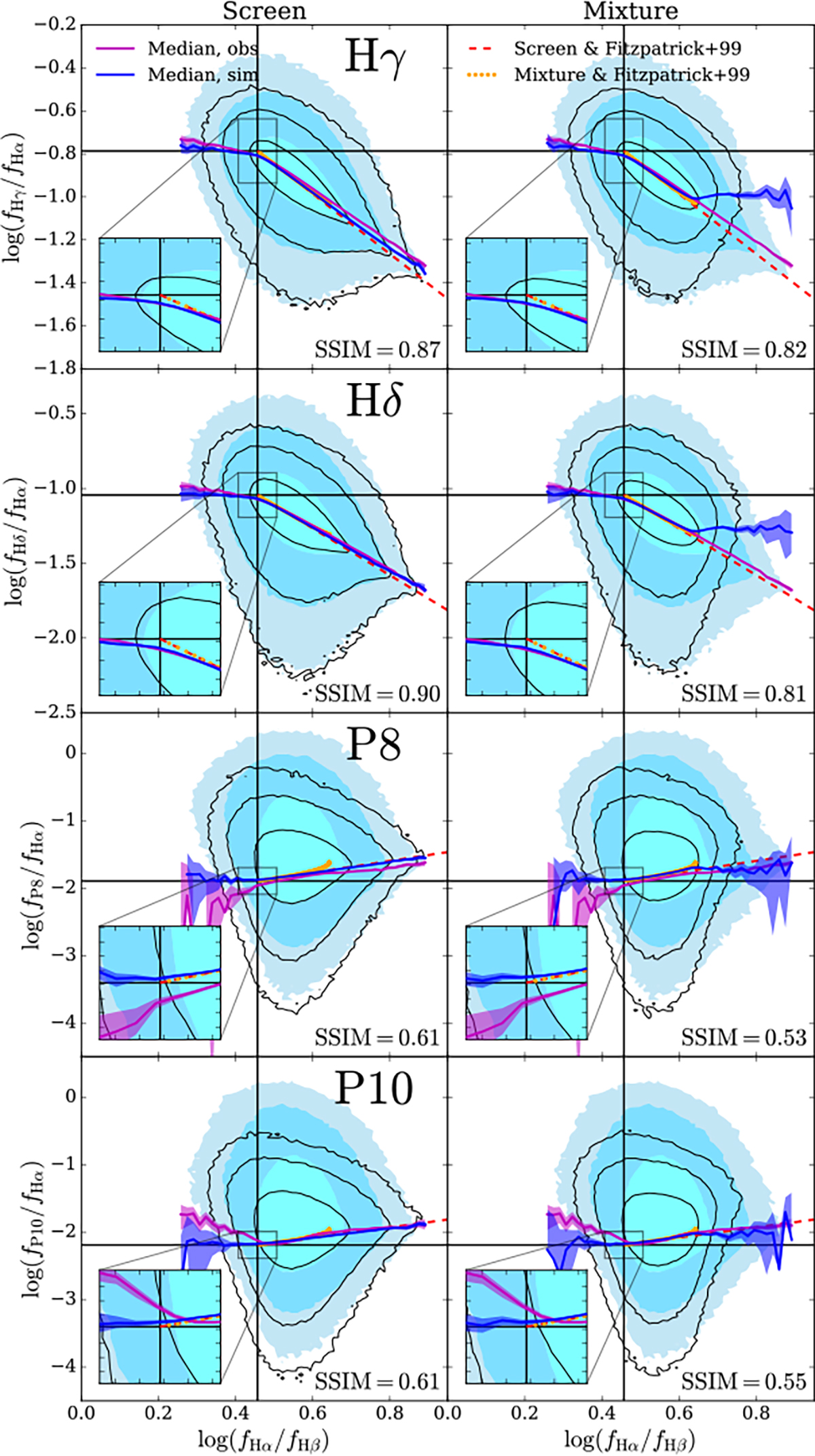
Comparisons of the line ratio plots between the observations and the simulated samples generated by assuming the foreground screen dust model (left) and the uniform mixture model (right). In each panel, the filled contours and black contour lines indicate the spaxel distributions of the observed and simulated samples, respectively, both of which enclose 68%, 95%, and 99% of the corresponding samples from inner to outer. The magenta (blue) curve and shaded regions denote the medians and their 3σ uncertainties for the observed (simulated) sample, respectively. Regions around the cross points of the intrinsic line ratios are zoomed in and shown in the lower-left insets. The SSIM index describing the similarity in density distribution between the observed and simulated data is listed in the lower-right corner of each panel. Other symbols are the same as those in Fig. 2.
Current usage metrics show cumulative count of Article Views (full-text article views including HTML views, PDF and ePub downloads, according to the available data) and Abstracts Views on Vision4Press platform.
Data correspond to usage on the plateform after 2015. The current usage metrics is available 48-96 hours after online publication and is updated daily on week days.
Initial download of the metrics may take a while.