Fig. 7
Download original image
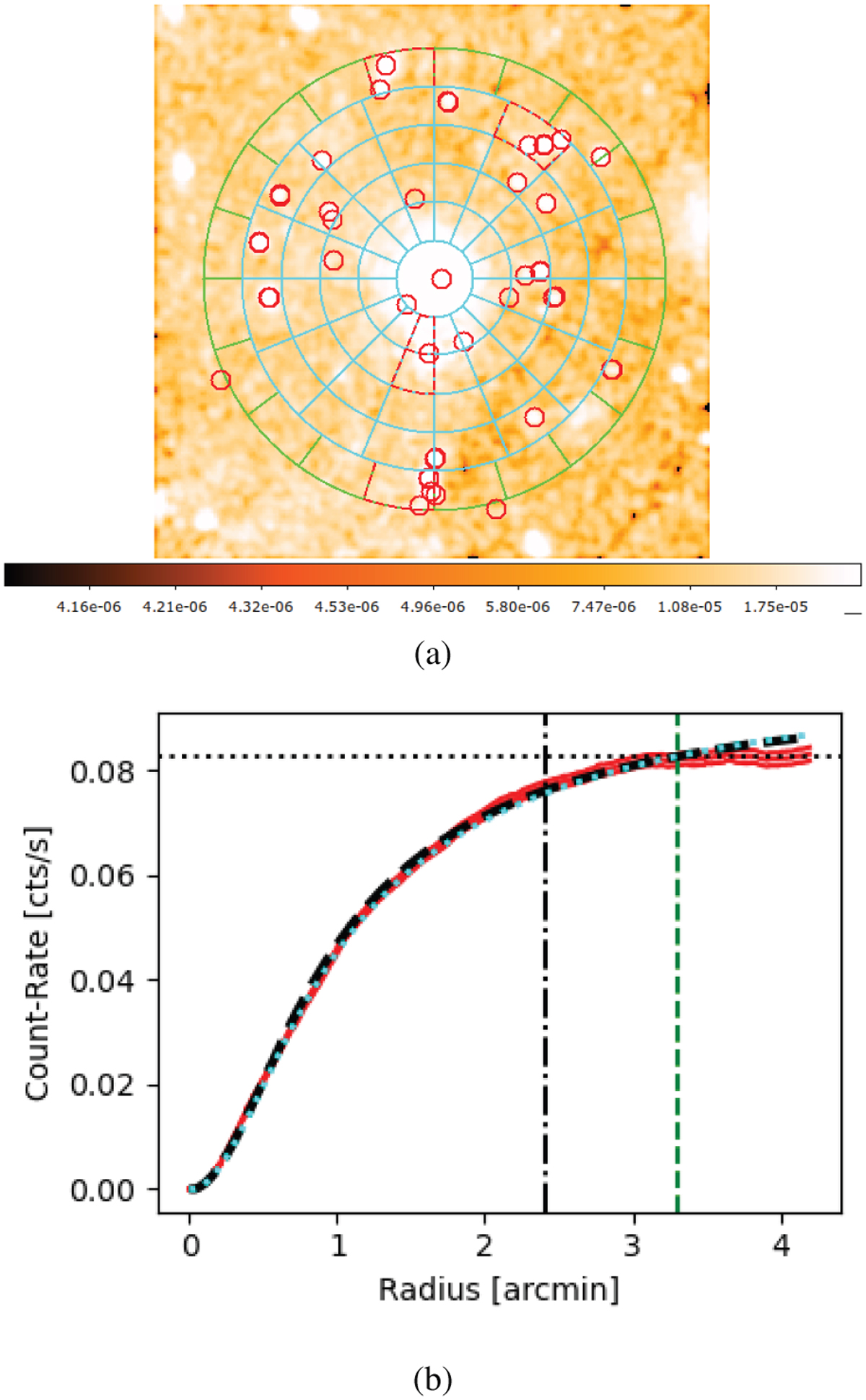
Region selection and growth curve for the cluster “es_1”, as an example. Panel a: the reconstructed X-ray image in log scale, overlaid with the source regions (cyan sectors) and background regions (green sectors) for the growth curve analysis. The red circles outside the central cyan circle, and red dashed sectors are masks for contaminates. Panel b: growth curve plot, with the integrated count rate versus the radius shown in red (1 σ range in pink), where black dot-dashed and green dashed vertical lines label the R500 and the significant radius, and the horizontal dotted line for the count rate in the plateau. The black dashed curve is the best-fitting model for the growth curve, with the β = 0.683 for this source. The model with typical β = 2/3 is plotted in a cyan dotted curve as a comparison.
Current usage metrics show cumulative count of Article Views (full-text article views including HTML views, PDF and ePub downloads, according to the available data) and Abstracts Views on Vision4Press platform.
Data correspond to usage on the plateform after 2015. The current usage metrics is available 48-96 hours after online publication and is updated daily on week days.
Initial download of the metrics may take a while.