Fig. 8.
Download original image
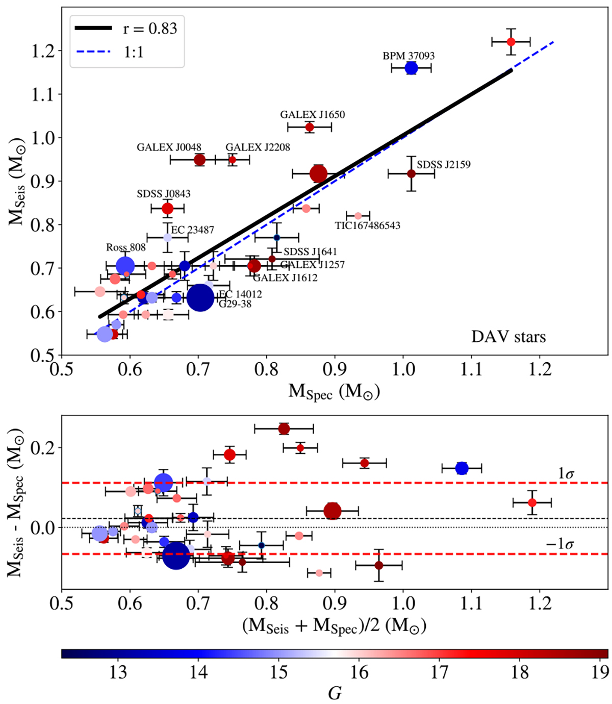
Comparison of stellar masses for DAV stars. Upper panel: Dispersion diagram showing the comparison between the spectroscopic and the seismological masses for DAVs (see Table B.1). The blue dashed line indicates the 1:1 correspondence between the two sets of stellar masses. The labeled stars correspond to the cases where the mass estimates exhibit substantial discrepancies. The thick black line indicates the Pearson correlation fit. Lower panel: Bland-Altman diagram showing the mass difference in terms of the average mass for each object. The black short-dashed line corresponds to the mean difference, ⟨ΔM⋆⟩, whereas the two red dashed lines represent the limits of agreement, ⟨ΔM⋆⟩, considering the deviation of ±1σ. In both panels, the size of each symbol is proportional to the number of g-mode pulsation periods used to derive the seismological model (fourth column of Table B.1), and the colour palette indicates the apparent magnitude GaiaG (fifth column of Table A.1) of each star.
Current usage metrics show cumulative count of Article Views (full-text article views including HTML views, PDF and ePub downloads, according to the available data) and Abstracts Views on Vision4Press platform.
Data correspond to usage on the plateform after 2015. The current usage metrics is available 48-96 hours after online publication and is updated daily on week days.
Initial download of the metrics may take a while.