Fig. 1.
Download original image
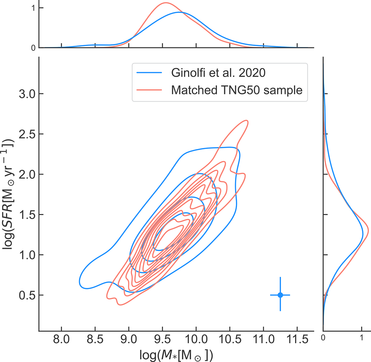
Comparison of the distribution of the SFRs and M* values between the simulated (red) and observed (blue) samples (75 and 50 galaxies, respectively). The joint distribution is visualized using density contours. The contour spacing represents the density of data points, with closer contours indicating regions of higher data density. The blue bars in the bottom-right corner represent the average 1-sigma error for the SFR and M* of the observations. The histograms along the x and y axes provide marginal distributions of the M* and SFR, respectively, for both observed and simulated samples.
Current usage metrics show cumulative count of Article Views (full-text article views including HTML views, PDF and ePub downloads, according to the available data) and Abstracts Views on Vision4Press platform.
Data correspond to usage on the plateform after 2015. The current usage metrics is available 48-96 hours after online publication and is updated daily on week days.
Initial download of the metrics may take a while.