Fig. 11.
Download original image
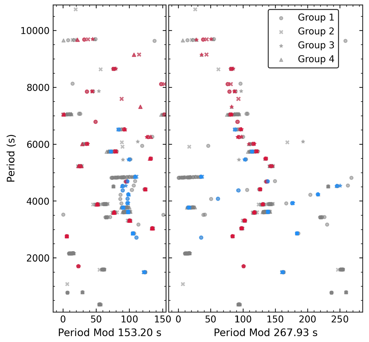
Observed frequency distribution in echelle diagrams. Various symbols represent frequencies extracted from different data sets (see the legend for details). The right-hand side panel shows the echelle diagram for a period spacing ΔΠℓ = 1 = 267.93 s. The left-hand side panel is the echelle diagram for ΔΠℓ = 2 = 153.20 s. Red dots are the frequencies matching the ℓ = 1 period spacing relation, while blue dots are the frequencies matching the ℓ = 2 period spacing relation. It can be seen that red and blue dots present a clear structure in the right and left echelle diagrams, respectively.
Current usage metrics show cumulative count of Article Views (full-text article views including HTML views, PDF and ePub downloads, according to the available data) and Abstracts Views on Vision4Press platform.
Data correspond to usage on the plateform after 2015. The current usage metrics is available 48-96 hours after online publication and is updated daily on week days.
Initial download of the metrics may take a while.