Fig. 9
Download original image
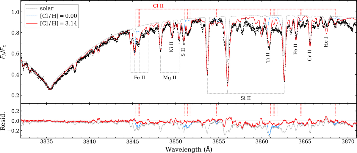
Estimate of the ionised chlorine abundance. The observed spectrum is shown as black dots. As indicated in the legend, three synthetic spectra are shown. The dotted grey curve has solar abundances across the board, and the dashed blue curve has nearly all abundances except for Cl adjusted to the values given in Table 3. The solid red curve is similar to the blue curve except that [Cl+ /H] has been increased by 3.14 dex.
Current usage metrics show cumulative count of Article Views (full-text article views including HTML views, PDF and ePub downloads, according to the available data) and Abstracts Views on Vision4Press platform.
Data correspond to usage on the plateform after 2015. The current usage metrics is available 48-96 hours after online publication and is updated daily on week days.
Initial download of the metrics may take a while.