Fig. 15.
Download original image
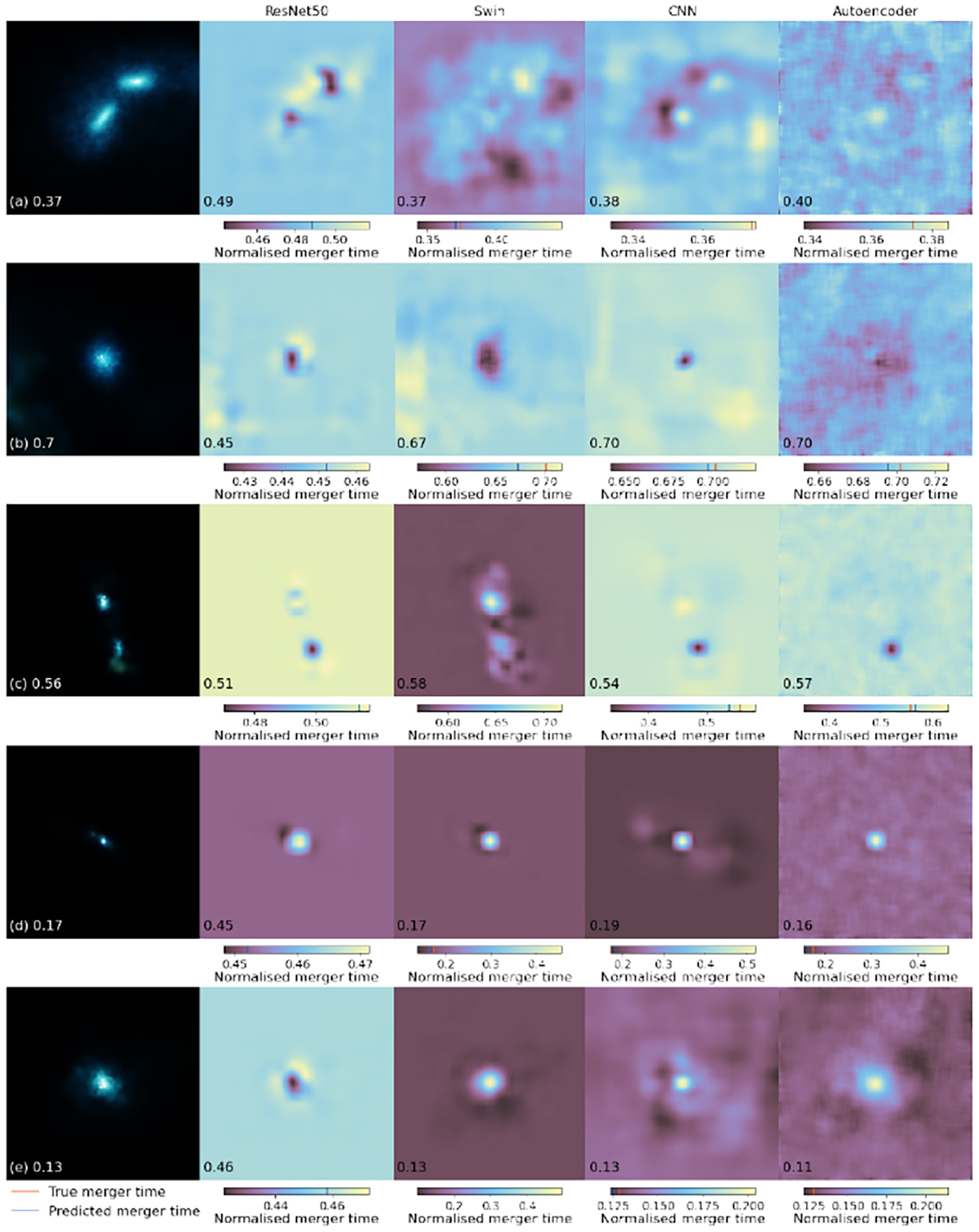
Heat maps with each pixel showing the average merger time of when it is occluded from ResNet50, Swin, CNN, and autoencoder as labelled by the column title. Each heat-map is colour scaled individually, where dark colours indicate an earlier time and light colours indicate a later time. True time is shown as red line in the colour bar while the un-occluded predicted time is shown as a yellow line. Original galaxy is shown on the left of each row as u, g, and r band composite with each channel individually arcsinh scaled twice and then normalised between 0 and 1. The true normalised merger time is shown in the left panel of each galaxy while the predicted normalised time is shown in each networks’ heat-map.
Current usage metrics show cumulative count of Article Views (full-text article views including HTML views, PDF and ePub downloads, according to the available data) and Abstracts Views on Vision4Press platform.
Data correspond to usage on the plateform after 2015. The current usage metrics is available 48-96 hours after online publication and is updated daily on week days.
Initial download of the metrics may take a while.