Fig. 7
Download original image
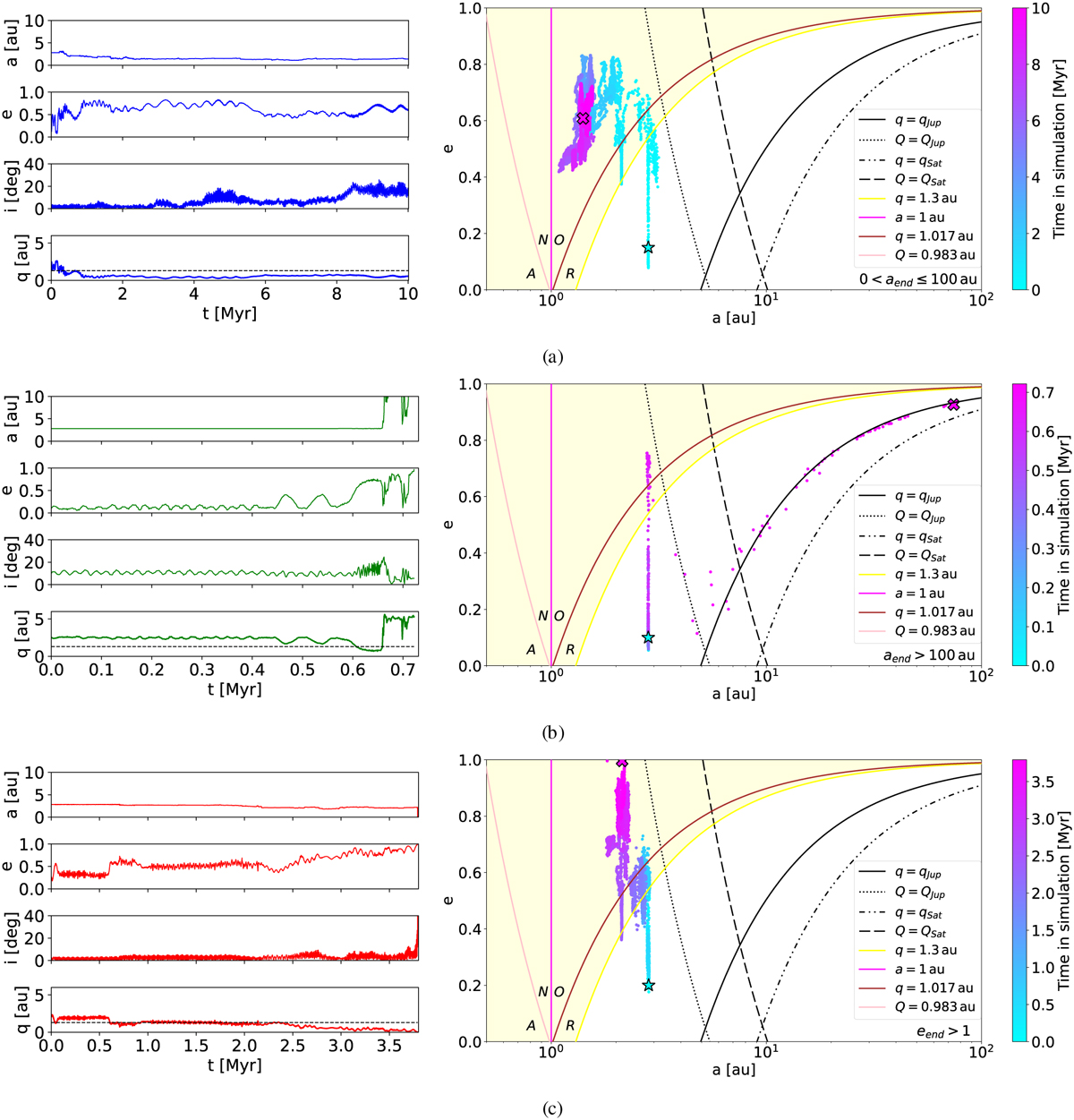
Orbital evolution of three test particles. The left panels represent the evolution of the semi-major axis, a, eccentricity, e, inclination, i, and perihelion distance, q, with time. The colours of the lines represent the final state of the particle, as in Fig. 6, i.e. red = a hyperbolic orbit, green = an orbit with a > 100 au, and blue = a survivor for 10 Myr. The dashed black line inside the graph for q represents q = 1.3 au. The right panels represent the evolution of the particle from the left panel in the (a, e) plane. The initial state is represented by a cyan star and the final position by a magenta cross. The yellow area delimits the NEO region with q < 1.3 au. Pink, magenta, and brown lines divide the NEO region into four main groups: R = amoRs, O = apollOs, N = ateNs, and A = atirAs. The colour bar represents the lifetime of the particle, i.e. a different time interval for each particle. Panel a: particle with initial values (a, e, i, ω, Ω, M, FLI) = (2.8250 au, 0.15, 0°, 0°, 0°, 162.9050°, 6.2225). Panel b: (a, e, i, ω, Ω, M, FLI) = (2.8241 au, 0.1, 10°, 120°, 180°, 18.1006°, 7.0004). Panel c: (a, e, i, ω, Ω, M, FLI) = (2.8359 au, 0.2, 0°, 0°, 300°, 225.2514°, 7.9464).
Current usage metrics show cumulative count of Article Views (full-text article views including HTML views, PDF and ePub downloads, according to the available data) and Abstracts Views on Vision4Press platform.
Data correspond to usage on the plateform after 2015. The current usage metrics is available 48-96 hours after online publication and is updated daily on week days.
Initial download of the metrics may take a while.