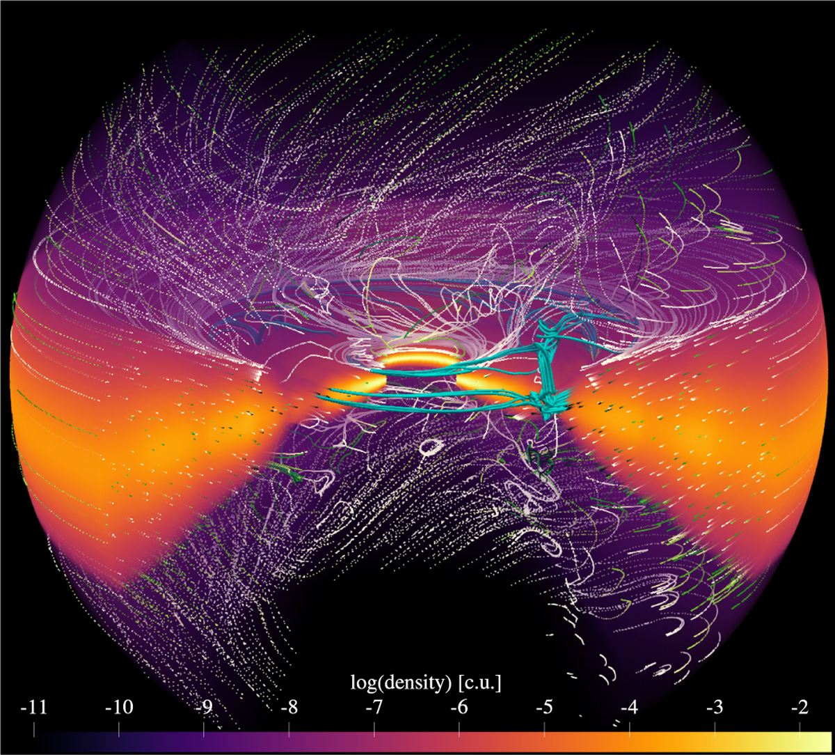
Fig. 4
Download original image
3D visualisation of the density in the PEWIND model created from a snapshot a t = 100 orbits. The dotted lines are gas streamlines. Their colour represents the integration time, which is useful for understanding the direction gas follows along the streamline (from white to green). The cyan tubes are gas streamlines traced back from within the planet’s Hill sphere and indicate example paths that the gas can take towards the planet.
Current usage metrics show cumulative count of Article Views (full-text article views including HTML views, PDF and ePub downloads, according to the available data) and Abstracts Views on Vision4Press platform.
Data correspond to usage on the plateform after 2015. The current usage metrics is available 48-96 hours after online publication and is updated daily on week days.
Initial download of the metrics may take a while.