Fig. 15.
Download original image
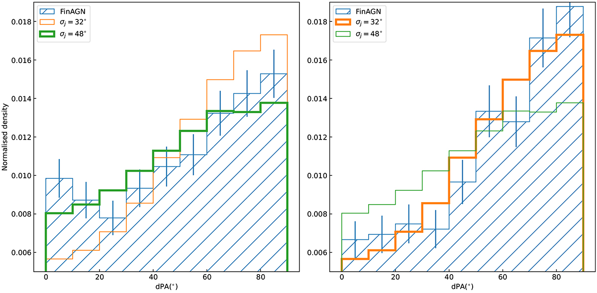
Simulated dPA distributions using the single component model compared with the observed dPA distribution. Left: simulated dPA distributions compared with the dPA distribution of the moreL+massive sample. Right: simulated dPA distributions compared with the dPA distribution of the lessL+massive sample. The hatched histograms with errorbars denote the observed distributions in each panel. The σj for the two simulated distributions are listed in the two panels. The simulated distribution corresponding to the largest pnull in each sample is highlighted in each panel.
Current usage metrics show cumulative count of Article Views (full-text article views including HTML views, PDF and ePub downloads, according to the available data) and Abstracts Views on Vision4Press platform.
Data correspond to usage on the plateform after 2015. The current usage metrics is available 48-96 hours after online publication and is updated daily on week days.
Initial download of the metrics may take a while.