Fig. 14.
Download original image
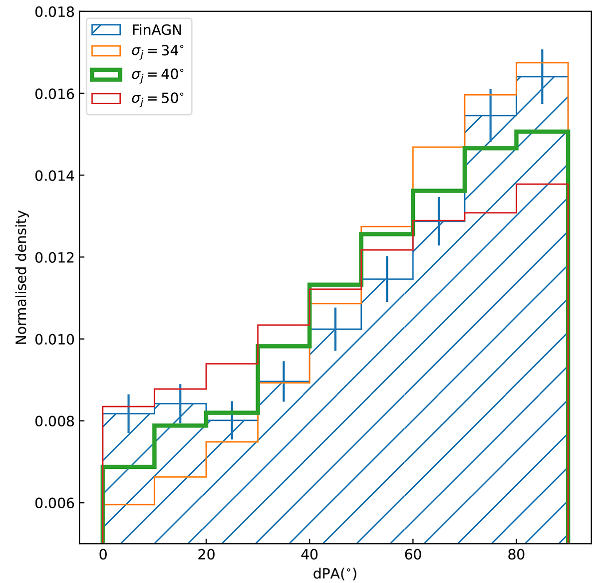
Simulated dPA distributions compared with the dPA distribution of the FinAGN sample. The hatched histogram with errorbars denotes the FinAGN sample. The σj for three simulated distributions are listed in the figure. The K–S tests indicate a largest pnull corresponding to the smallest probability that the simulated and observed distributions are drawn from different populations when σj = 46°, which is marked with thick lines in the figure.
Current usage metrics show cumulative count of Article Views (full-text article views including HTML views, PDF and ePub downloads, according to the available data) and Abstracts Views on Vision4Press platform.
Data correspond to usage on the plateform after 2015. The current usage metrics is available 48-96 hours after online publication and is updated daily on week days.
Initial download of the metrics may take a while.