Open Access
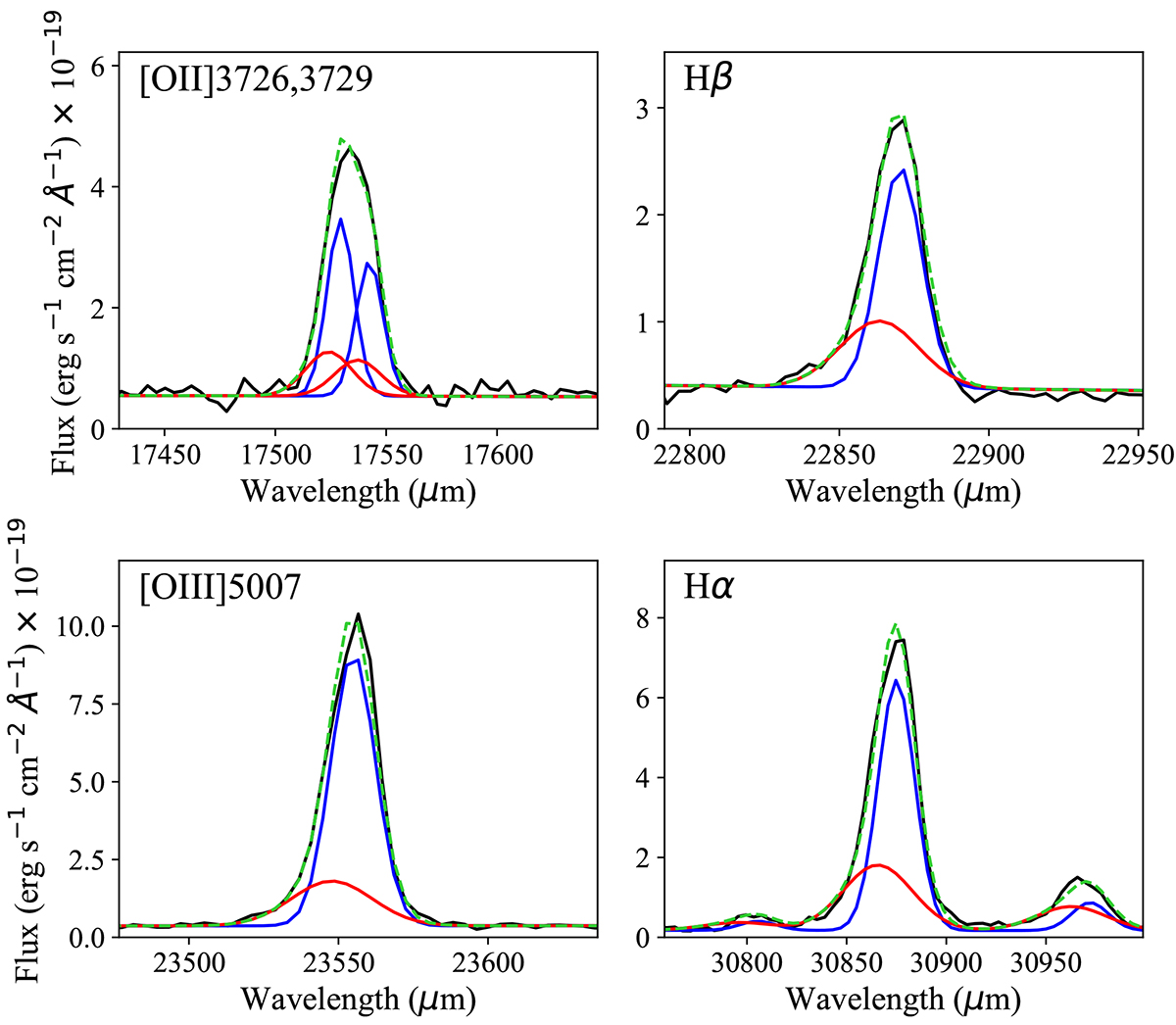
Fig. 13.
Download original image
Spectral modelling of the main emission lines in the integrated spectrum of the region hosting the ionised outflow. The blue and red lines correspond to the narrow and broad components, respectively, which summed together (green line) provide the best fit to the data (black line).
Current usage metrics show cumulative count of Article Views (full-text article views including HTML views, PDF and ePub downloads, according to the available data) and Abstracts Views on Vision4Press platform.
Data correspond to usage on the plateform after 2015. The current usage metrics is available 48-96 hours after online publication and is updated daily on week days.
Initial download of the metrics may take a while.