Fig. 3
Download original image
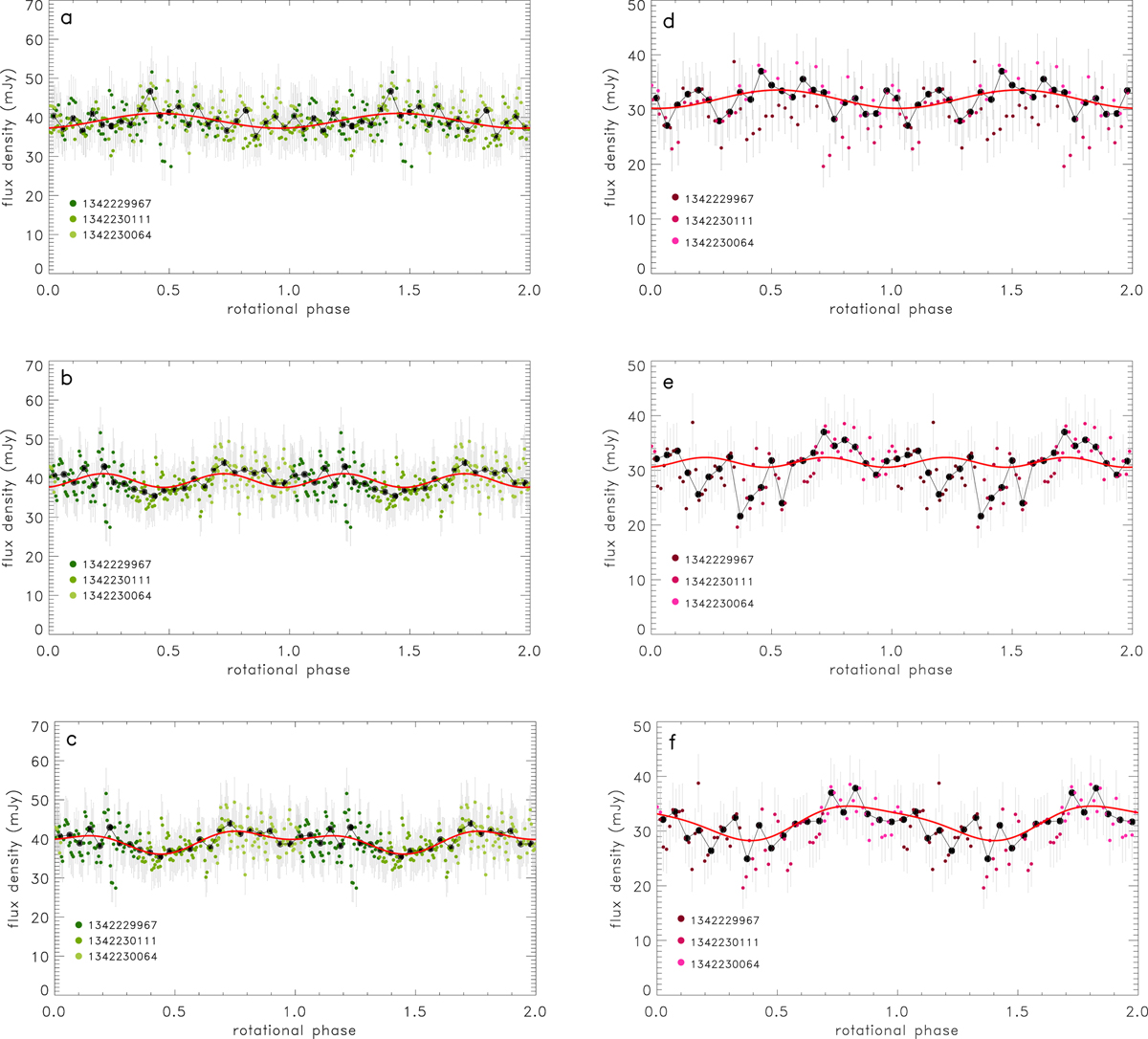
Herschel/PACS 100 and 160 µm folded light curves of Quaoar. Panel a: 100 µm thermal light curve folded with the P = 8.876 h period. The red curve is the best-fit single-peak sine function. The black dots and curve represent the binned data. The different coloured dots correspond to different OBSIDs, as indicated in the legend. Panel b: 100 µm thermal light curve folded with the P = 17.752 h period. The red curve is a best-fit sine function, with a half-period (P = 8.876 h), and assuming equal half-amplitudes. Panel c: same as (b), but here the red curve is the best-fit second-order sine function, a combination of P = 8.876 h and P = 17.752 h components, i.e. allowing different amplitudes for the first and second half of the folded light curve. Panels d–f: Same as panels a–c, but using the 160 µm data.
Current usage metrics show cumulative count of Article Views (full-text article views including HTML views, PDF and ePub downloads, according to the available data) and Abstracts Views on Vision4Press platform.
Data correspond to usage on the plateform after 2015. The current usage metrics is available 48-96 hours after online publication and is updated daily on week days.
Initial download of the metrics may take a while.