Fig. 11.
Download original image
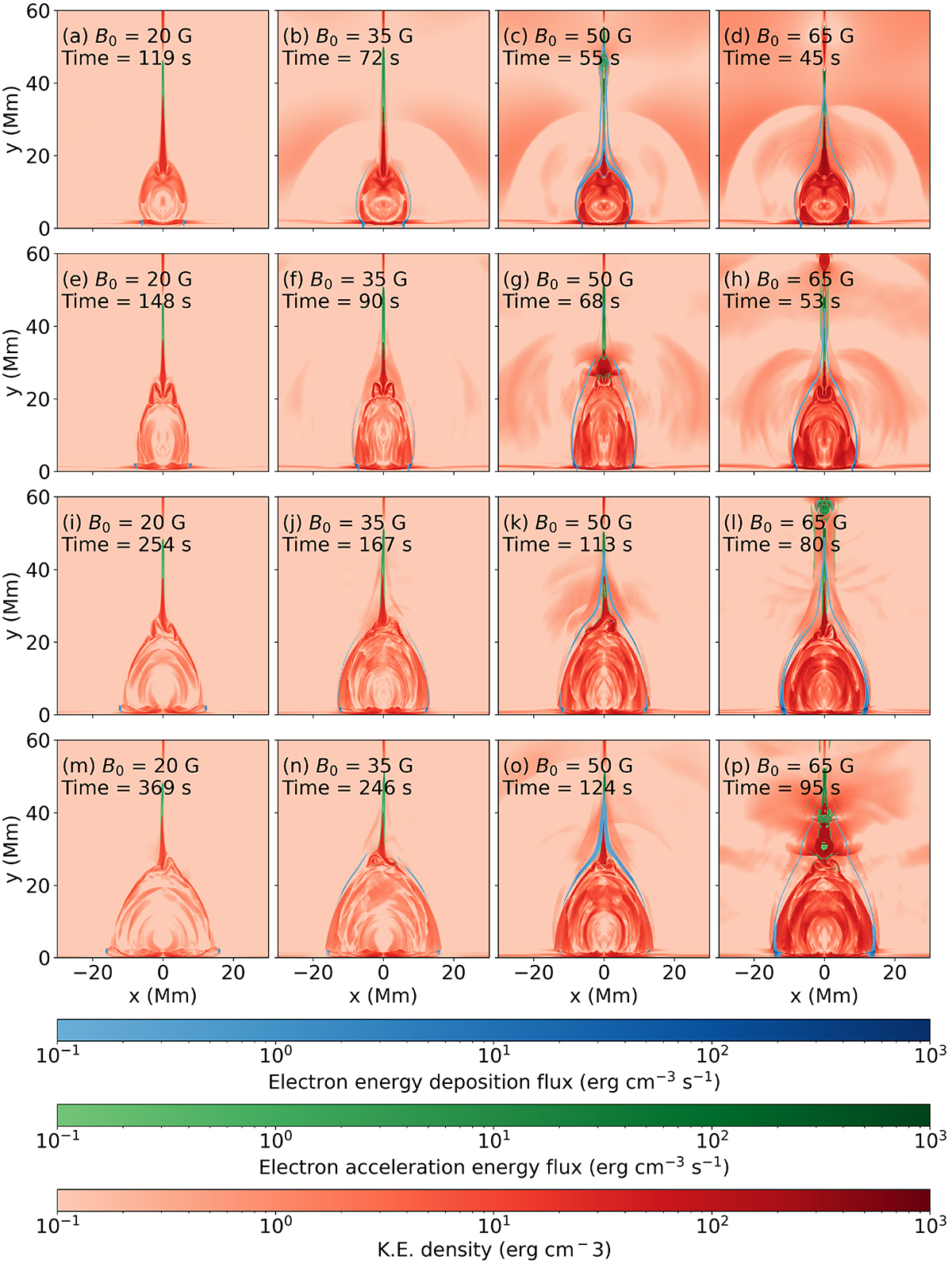
Kinetic energy density color maps. Kinetic energy density is shown in red and highlights the flare loops, the current sheets, and shocks traveling through the surrounding atmosphere. Overlays show the electron acceleration energy densities in green and the energy deposition density in blue. Energy densities for all panels of this figure have a lower saturation limit of 10−1 erg cm−2 s−1 and an upper limit of 103 erg cm−2 s−1. The columns from left to right show results for the experiments with background magnetic field strengths of B0 = 20 G, 35 G, 50 G, and 65 G, respectively. The top row shows the simulations at the time after the impact of the leading edge of the reconnection outflow jet. This impact and its reflection causes hot upflows from the chromosphere. The second row shows the time at which the flare loops have rebounded after their compression during the impact. The third and fourth rows show later times, when the loop tops settle and exhibit turbulent eddies on alternating sides of the central line (that is, a magnetic tuning fork process). An animated version of the figure is provided in the online materials.
Current usage metrics show cumulative count of Article Views (full-text article views including HTML views, PDF and ePub downloads, according to the available data) and Abstracts Views on Vision4Press platform.
Data correspond to usage on the plateform after 2015. The current usage metrics is available 48-96 hours after online publication and is updated daily on week days.
Initial download of the metrics may take a while.