Fig. 1.
Download original image
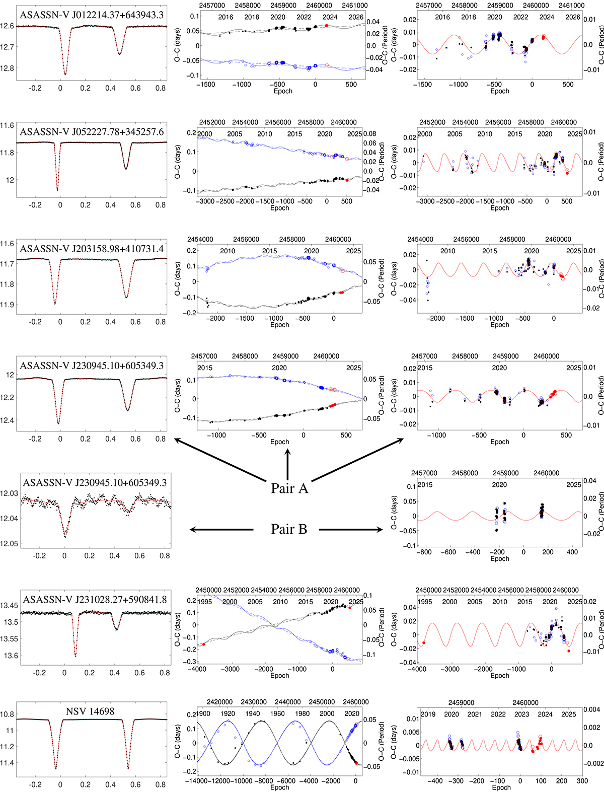
Analysed systems and their fits. Each row of figures represents one system. The figures in the left column are the light curve fits from TESS data, while in the right column are the diagrams showing the period changes. Middle plots show the complete fit (apsidal motion plus LTTE), right-hand plots are only LTTE fits. Black dots indicate primary eclipses, blue dots are the secondary ones, while the red data show our newly dedicated observations. The bigger the symbol, the higher the weight and precision with which it was derived.
Current usage metrics show cumulative count of Article Views (full-text article views including HTML views, PDF and ePub downloads, according to the available data) and Abstracts Views on Vision4Press platform.
Data correspond to usage on the plateform after 2015. The current usage metrics is available 48-96 hours after online publication and is updated daily on week days.
Initial download of the metrics may take a while.