Fig. 7.
Download original image
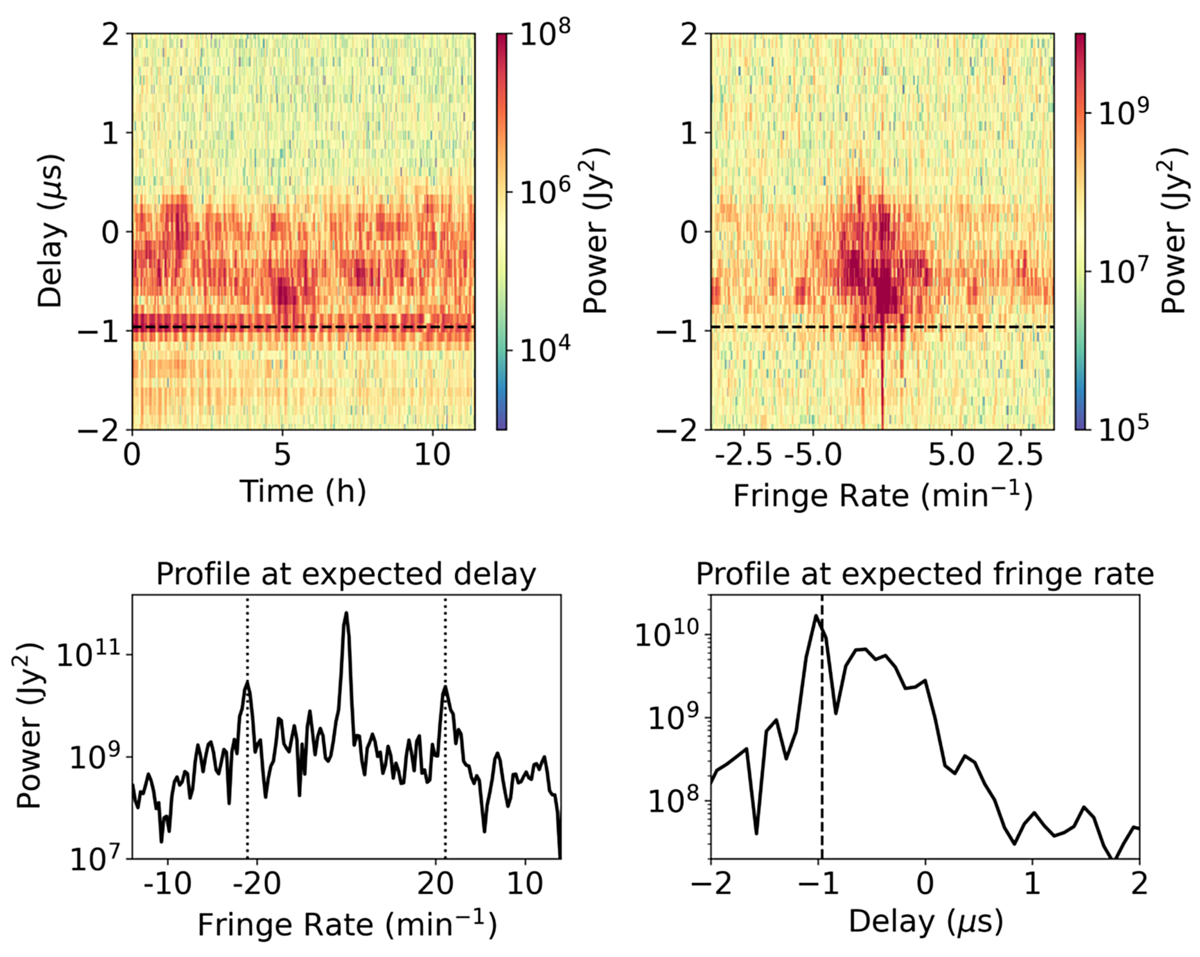
Delay and fringe rate power spectra of an example baseline where a strong RFI feature is seen. Delay vs. time plot (top-left) and delay vs. fringe rate plot (top-right) for the Stokes-I data after NCP subtraction. The dashed horizontal lines indicate the expected delay corresponding to the local RFI source at the building. Bottom left: power as a function of fringe rate at the expected delay for the local RFI source. The vertical dotted lines correspond to a fringe rate of 18 min−1. Bottom right: power as a function of delay at the expected fringe rate of 18 min−1. The vertical dashed line is the expected delay.
Current usage metrics show cumulative count of Article Views (full-text article views including HTML views, PDF and ePub downloads, according to the available data) and Abstracts Views on Vision4Press platform.
Data correspond to usage on the plateform after 2015. The current usage metrics is available 48-96 hours after online publication and is updated daily on week days.
Initial download of the metrics may take a while.