Fig. 4
Download original image
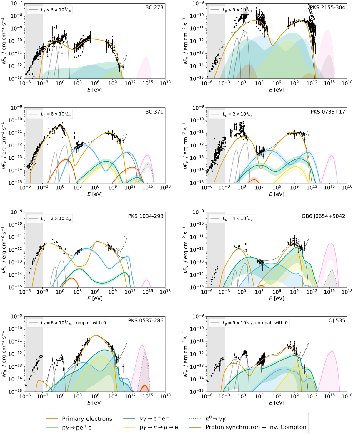
Examples of best-fit results for 8 sources in the sample, given in the observer’s frame. The total modeled photon emission (including attenuation on the EBL) is shown as a thin black curve, while the color curves represent the different components of that emission, as detailed in the caption. We note that the individual SED components are given without the effect of EBL attenuation, while for the total flux the EBL attenuation is taken into account. Additionally, we show as gray curves the thermal emission from the dust torus and the accretion disk. On the right-hand side of each plot we show either the best-fit neutrino flux (pink curve) or the upper limit for the predicted emission (pink shade). The black points represent the multiwavelength flux observations that are fitted in each case, while the gray inverted triangles represent upper limits. Finally, the gray shaded area represents the frequency range for which data are not fitted but rather considered as upper limits to the model, as explained in Sect. 2.4. As we can see, the origin of the X-ray and VHE gamma-ray fluxes may in some cases be dominated by leptonic emission (upper row), but can also be dominated by electromagnetic cascades triggered by proton interactions. The corresponding plot for all modeled sources, as well as the numerical data, can be found in the online repository https://github.com/xrod/lephad-blazars.
Current usage metrics show cumulative count of Article Views (full-text article views including HTML views, PDF and ePub downloads, according to the available data) and Abstracts Views on Vision4Press platform.
Data correspond to usage on the plateform after 2015. The current usage metrics is available 48-96 hours after online publication and is updated daily on week days.
Initial download of the metrics may take a while.