Fig. 3.
Download original image
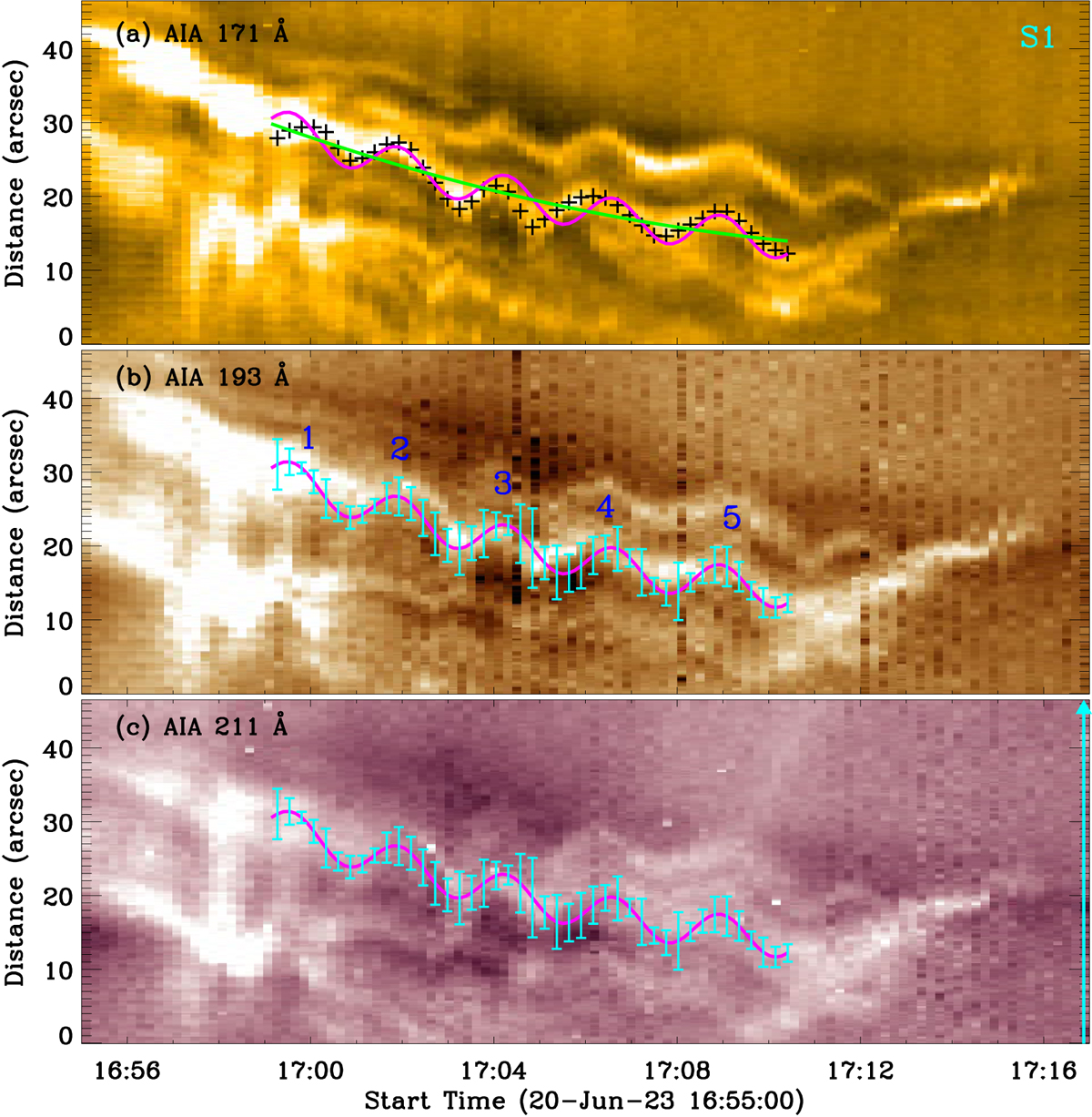
Time-distance maps show the transverse oscillation of the coronal loop at slit S1 in passbands of AIA 171 Å (a), 193 Å (b), and 211 Å (c). The pluses (‘+’) outline bright centers of the oscillating loop. The magenta curve and the cyan error bars represent the best-fitting result and their fitting uncertainties, whereas the green line indicates the background trend. The Arabic numerals mark five cycles of the loop oscillation. The cyan arrow indicates the slit direction.
Current usage metrics show cumulative count of Article Views (full-text article views including HTML views, PDF and ePub downloads, according to the available data) and Abstracts Views on Vision4Press platform.
Data correspond to usage on the plateform after 2015. The current usage metrics is available 48-96 hours after online publication and is updated daily on week days.
Initial download of the metrics may take a while.