Fig. 1.
Download original image
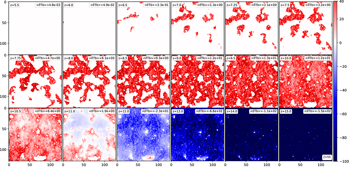
Timeline of δTb. The colour bars are in units of [mK]; ⟨δTb⟩ represents the mean of the temperature brightness. These maps come from a 21cmFAST simulation, taken at a given depth from the model ζ55 and for each redshift used in this study. White corresponds to the absence of signal, meaning that the hydrogen is ionised at this region. For this simulation, at z = 5.5, there is no neutral hydrogen anymore. Starting at z = 15, δTb is mainly seen in absorption (negative values in blue) until z = 11, where ⟨δTb⟩ becomes positive and the signal is seen in emission (positive values in red). During the whole process, HII bubbles grow with time. Figure 2 corresponds to the treion(r) associated to these maps.
Current usage metrics show cumulative count of Article Views (full-text article views including HTML views, PDF and ePub downloads, according to the available data) and Abstracts Views on Vision4Press platform.
Data correspond to usage on the plateform after 2015. The current usage metrics is available 48-96 hours after online publication and is updated daily on week days.
Initial download of the metrics may take a while.