Fig. 8
Download original image
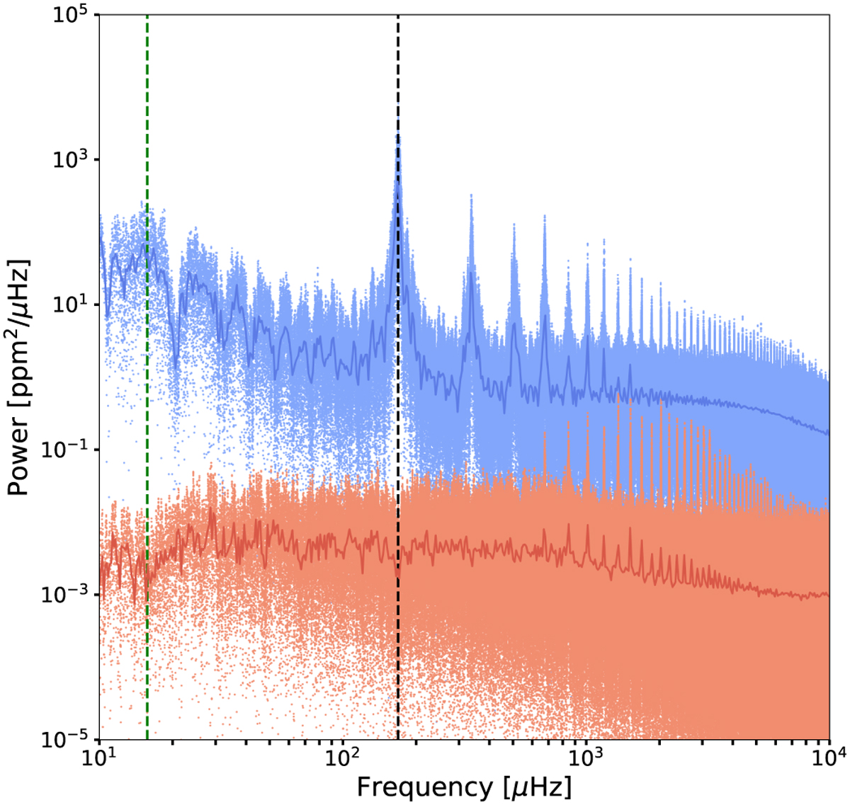
Power spectrum computed with the Lomb-Scargle technique as a function of frequency. The blue dots show raw flux measurements of all CHEOPS visits, while the red dots represent the detrended flux after the phase-curve model was removed. The dark blue and dark red curves represent the binned data. The dashed green vertical line corresponds to the orbital period of 55 Cnc e, and the vertical dashed black line corresponds to the CHEOPS orbital period of 101 min.
Current usage metrics show cumulative count of Article Views (full-text article views including HTML views, PDF and ePub downloads, according to the available data) and Abstracts Views on Vision4Press platform.
Data correspond to usage on the plateform after 2015. The current usage metrics is available 48-96 hours after online publication and is updated daily on week days.
Initial download of the metrics may take a while.