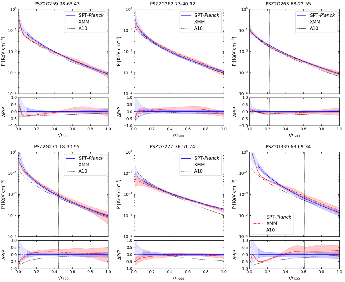
Fig. 10.
Download original image
Comparison between pressure profiles from XMM-Newton data (dash dotted red lines) and from the SPT-Planck joint fit (blue lines). The shaded regions correspond to the 68% credible intervals. The light blue dashed section of the SPT-Planck line marks the region inside the innermost SPT data point. The dotted black lines show the universal profile from Arnaud et al. (2010) for comparison. The vertical dashed lines indicate the FWHM of the SPT beam. The lower panels represent the relative deviation with respect to the SZ results. The ticks on the horizontal axis correspond to the edges of the bins of SPT data.
Current usage metrics show cumulative count of Article Views (full-text article views including HTML views, PDF and ePub downloads, according to the available data) and Abstracts Views on Vision4Press platform.
Data correspond to usage on the plateform after 2015. The current usage metrics is available 48-96 hours after online publication and is updated daily on week days.
Initial download of the metrics may take a while.