Fig. 4.
Download original image
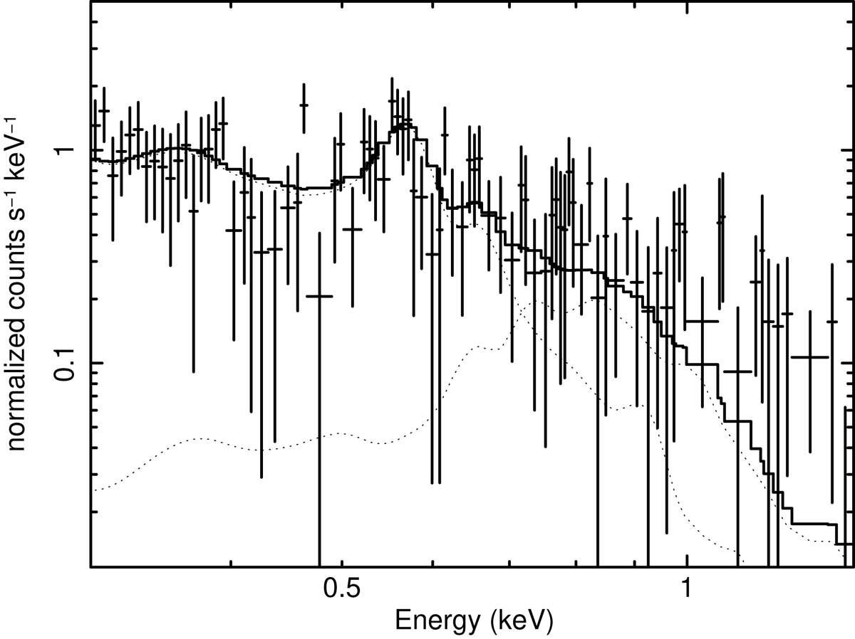
Spectrum of the diffuse emission extracted from the black rectangle in Fig. 3 (called “bright”) minus the emission from the red rectangle (“dim”). The black line shows the best-fit model, while the dotted lines show the two best fit hot plasma components. At energies higher than ∼1 keV the difference spectrum shows a rapidly decreasing spectrum. The plot, in logarithmic scale shows only the fraction of energy bins with positive values, while the negative values are not displayed. Consequently, at high energies the data displayed are biased high, while the model properly accounts for both positive and negative energy bins.
Current usage metrics show cumulative count of Article Views (full-text article views including HTML views, PDF and ePub downloads, according to the available data) and Abstracts Views on Vision4Press platform.
Data correspond to usage on the plateform after 2015. The current usage metrics is available 48-96 hours after online publication and is updated daily on week days.
Initial download of the metrics may take a while.