Fig. 13
Download original image
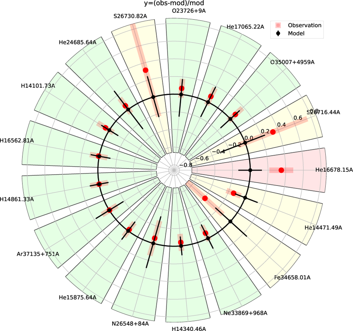
Comparison between observed and modeled fluxes for the ionized gas model MI,opt of I Zw 18. Plotted values in red are the difference between observations and models normalized by the model value. MULTIGRIS produces this plot in cartesian and polar coordinates, we show here the latter for illustration and because it is better adapted to a large number of observations. The black circle, black dots, and orthogonal black lines indicate the model and the red points and red error bars indicate the observations. The color of the sector is green if observations and models agree within errors and yellow if the model agrees within the observed error bar.
Current usage metrics show cumulative count of Article Views (full-text article views including HTML views, PDF and ePub downloads, according to the available data) and Abstracts Views on Vision4Press platform.
Data correspond to usage on the plateform after 2015. The current usage metrics is available 48-96 hours after online publication and is updated daily on week days.
Initial download of the metrics may take a while.