Free Access
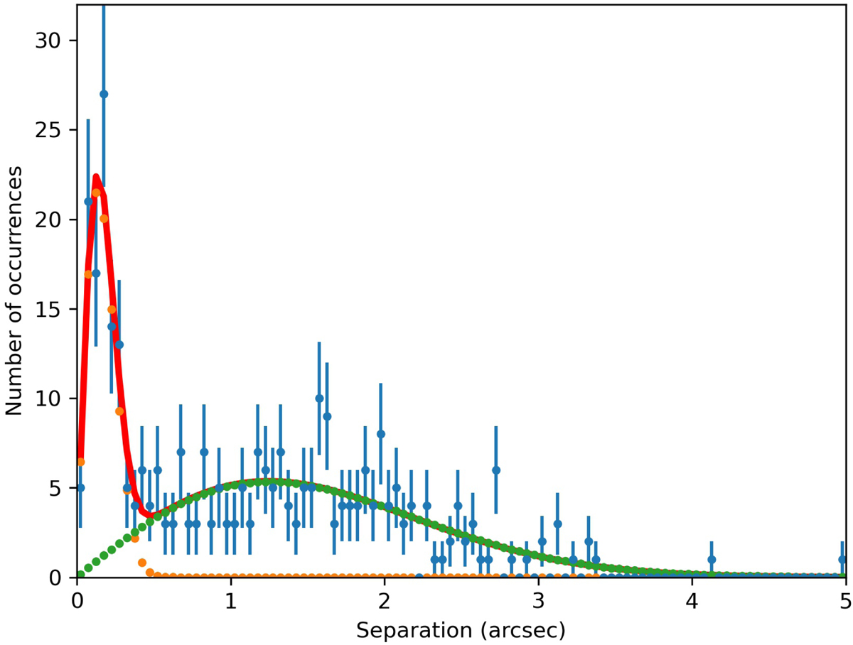
Fig. 1.
Download original image
Nearest neighbor distribution between the X-ray sources in the Chandra core region and the Gaia entries. The yellow curve denotes a fit of a Rayleigh distribution to the true matches, the nearest neighbor distribution to the random matches is shown in green, and the summed curve in red; see text for details.
Current usage metrics show cumulative count of Article Views (full-text article views including HTML views, PDF and ePub downloads, according to the available data) and Abstracts Views on Vision4Press platform.
Data correspond to usage on the plateform after 2015. The current usage metrics is available 48-96 hours after online publication and is updated daily on week days.
Initial download of the metrics may take a while.