Fig. 16
Download original image
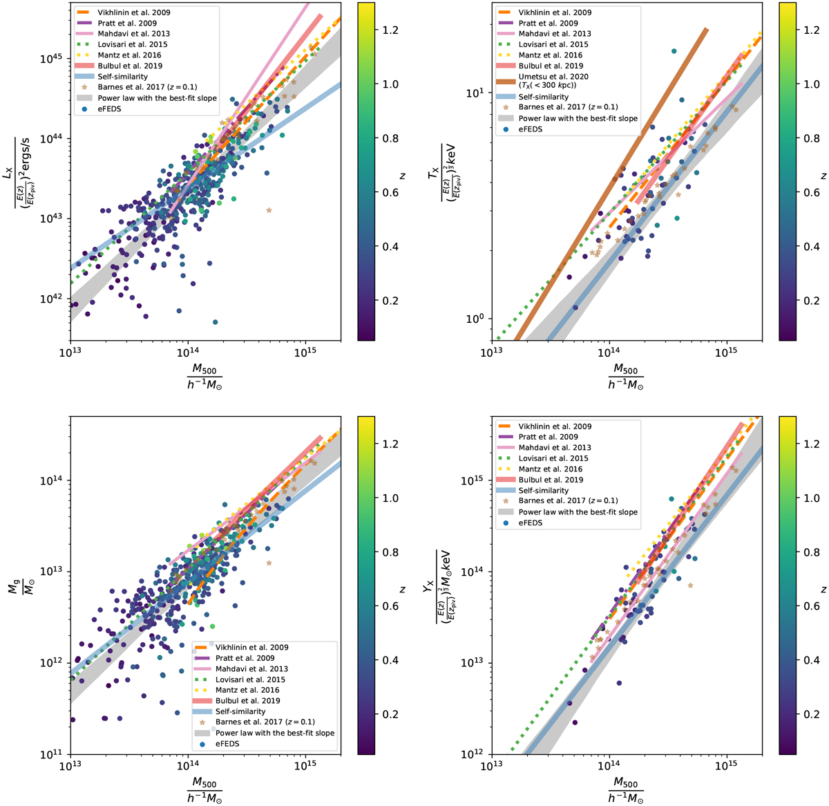
Comparison between the eFEDS sample and the results from the literature for LX (upper-left), TX (upper-right), Mg (lower-left), and FX (lower-right). The eFEDS clusters are shown by the circles color coded by the redshift. The 68% confidence levels of the best-fit models at the pivotal redshift zPiv = 0.35 are plotted as the gray shaded regions. The self-similar prediction with the normalization anchored to the best-fit value of the eFEDS sample is shown by the blue line, while the results from the literature are indicated by different colors. The simulated clusters (Barnes et al. 2017) are marked as the golden stars. We apply a correction factor to the cluster mass from the literature to account for the systematic difference in M500, following Appendix D.
Current usage metrics show cumulative count of Article Views (full-text article views including HTML views, PDF and ePub downloads, according to the available data) and Abstracts Views on Vision4Press platform.
Data correspond to usage on the plateform after 2015. The current usage metrics is available 48-96 hours after online publication and is updated daily on week days.
Initial download of the metrics may take a while.