Fig. 5
Download original image
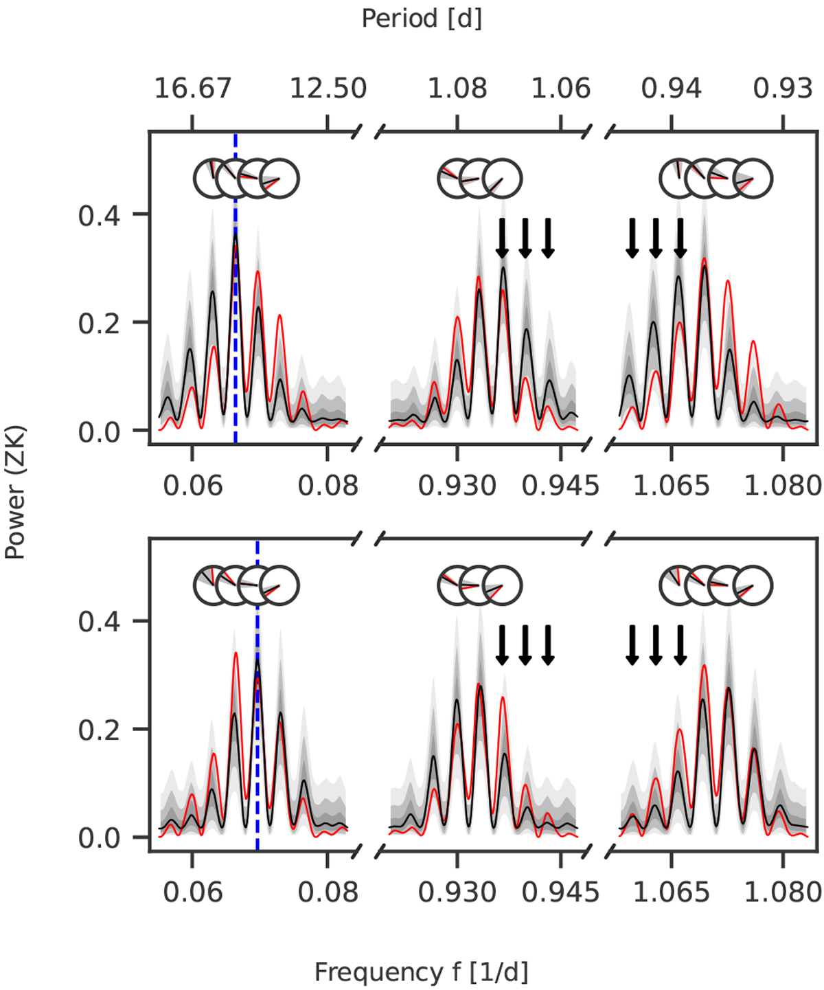
Alias test for the 14.3-day and 15.0-day periods using AliasFinder. We generated 5000 synthetic datasets for each period to produce synthetic periodograms (black lines), which are compared with the periodogram of the observed data (red lines). The simulation for the 15.0-day signal is shown in the top row and the simulation for the 14.3-day signal in the bottom row, each period indicated by a vertical blue dashed line, respectively. Black lines depict the median of the samples for each simulation, and the grey shaded areas are the 50, 90, and 99% confidence intervals. Furthermore, the phases of the peaks as determined by the GLS periodogram are displayed in the circles, following the same colour scheme (the grey shades denote the standard deviations of the simulated peaks). The black arrows point out the difference in the periodograms for the daily aliases that allows to identify the best matching period (see the text for the discussion).
Current usage metrics show cumulative count of Article Views (full-text article views including HTML views, PDF and ePub downloads, according to the available data) and Abstracts Views on Vision4Press platform.
Data correspond to usage on the plateform after 2015. The current usage metrics is available 48-96 hours after online publication and is updated daily on week days.
Initial download of the metrics may take a while.