Fig. 18
Download original image
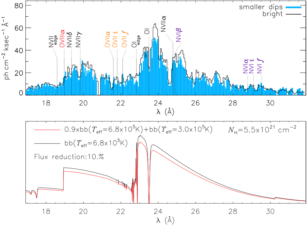
Illustration of spectral changes with the small dips. Top: comparison of spectra extracted during the bright intervals (black histogram) and during three smaller dips after the deep dip (light blue). The emission only deviates at intermediate wavelengths but is similar at long wavelengths (driven by NH) and at short wavelengths (driven by Teff and edge absorption). Bottom: Ad hoc model to attempt to reproduce this behaviour. The black curve represents a blackbody curve (in arbitrary flux units) with the best-fit parameters to the observed bright spectrum. The red curve represents the sum of the black curve, reduced by 10%, and a blackbody spectrum with a lower temperature but absorbed by the same NH (see legend for values). The red model could be compared to the spectrum extracted during the smaller dips. See Sect. 6.1 for discussion.
Current usage metrics show cumulative count of Article Views (full-text article views including HTML views, PDF and ePub downloads, according to the available data) and Abstracts Views on Vision4Press platform.
Data correspond to usage on the plateform after 2015. The current usage metrics is available 48-96 hours after online publication and is updated daily on week days.
Initial download of the metrics may take a while.