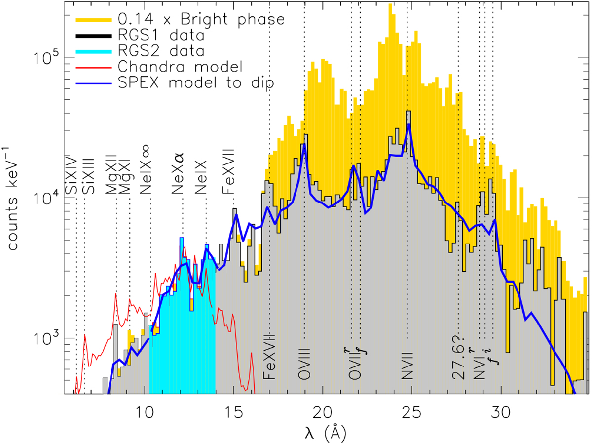
Fig. 16
Download original image
Comparisons of spectral models with the dip (grey) and bright (yellow) spectra. The red line is the best-fit model to the earlier Chandra spectrum on day 6.3 (Orio et al. 2020), folded through the RGS response, and one can see that it has more hard emission and less soft emission than the dip spectrum on day 18.12. The blue line indicates the SPEX model for the dip spectrum, see Sect. 4.3.1 for discussion.
Current usage metrics show cumulative count of Article Views (full-text article views including HTML views, PDF and ePub downloads, according to the available data) and Abstracts Views on Vision4Press platform.
Data correspond to usage on the plateform after 2015. The current usage metrics is available 48-96 hours after online publication and is updated daily on week days.
Initial download of the metrics may take a while.