Free Access
Fig. 6
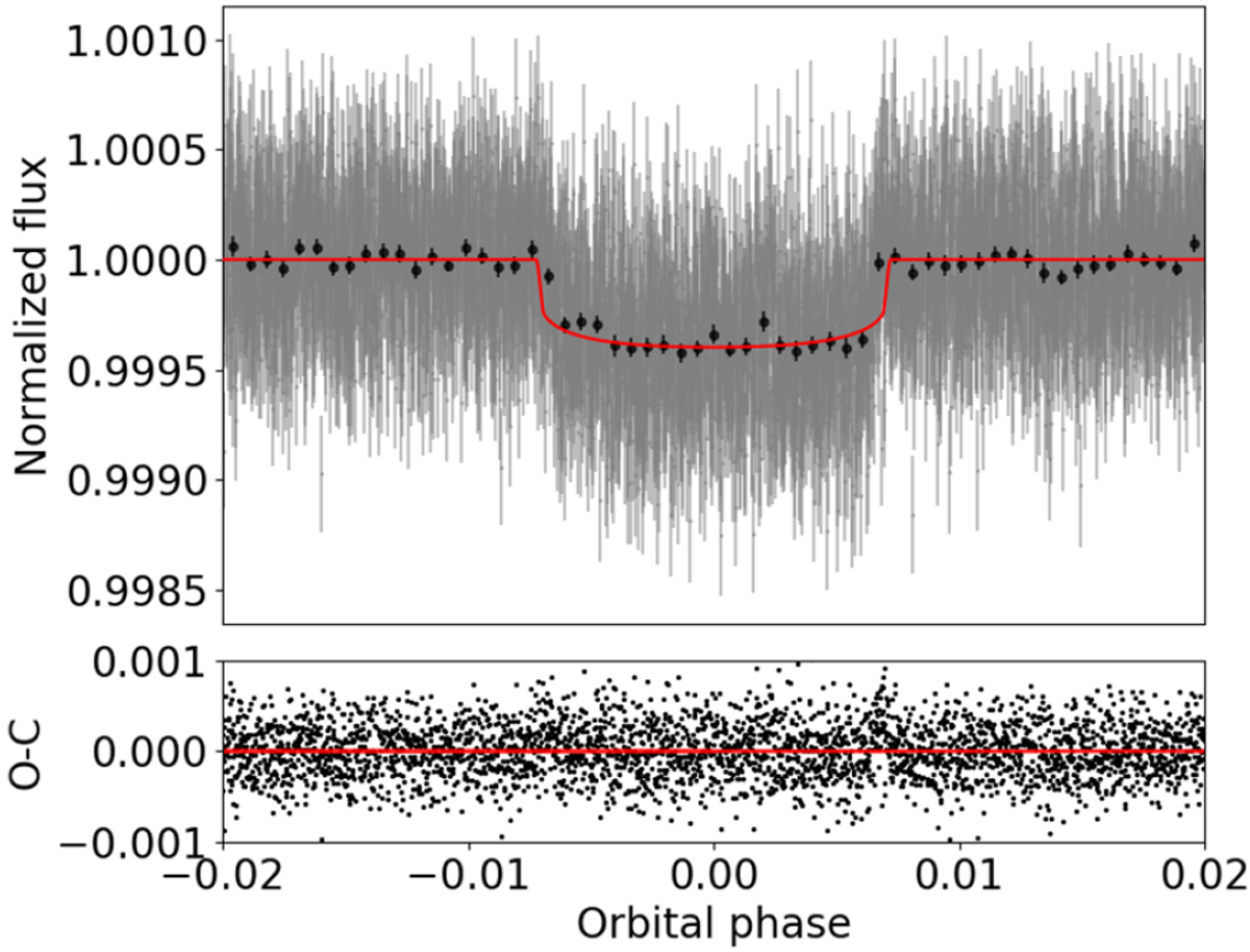
Top: phase-folded transit light curve of HD 5278 b from eight individual transit events. The best-fit transit model produced in the combined ESPRESSO and TESS data analysis in Sect. 4.3 is depicted by the red curve. The black dots represent data averaged over 13.8 min bins. Bottom: post-fit residuals.
Current usage metrics show cumulative count of Article Views (full-text article views including HTML views, PDF and ePub downloads, according to the available data) and Abstracts Views on Vision4Press platform.
Data correspond to usage on the plateform after 2015. The current usage metrics is available 48-96 hours after online publication and is updated daily on week days.
Initial download of the metrics may take a while.