Fig. 4
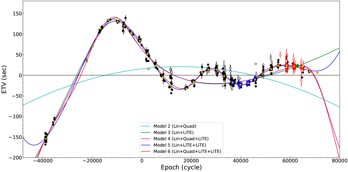
ETV diagram of HW Vir with best-fit curves of all models. The ETV diagram is corrected by the results of the linear fit. Color-filled circles represents the primary mid-eclipse timings, while white-filled ones represent the secondaries. The black markers are for data from the literature, blue ones are for SWASP, green for Kepler K2, red for our own observations, and yellow markers represent seasonal binned data.
Current usage metrics show cumulative count of Article Views (full-text article views including HTML views, PDF and ePub downloads, according to the available data) and Abstracts Views on Vision4Press platform.
Data correspond to usage on the plateform after 2015. The current usage metrics is available 48-96 hours after online publication and is updated daily on week days.
Initial download of the metrics may take a while.